BigTime Mobile
Rebuilding an App From Scratch
From Broken to Beloved: A Mobile Comeback Story
UX & Research Director | Made at BigTime, 2023-25
The Team:
UX Designers: Monika Gontarz, Bartosz Ujma
Vendor Support: DEPT Agency
PMs: Agata Szocik, Mart Pat Holtrop, Leia Pitcher
Devs: Patryk Kizak, Wojciech Serewis, Nick Devereaux, Jon Cain
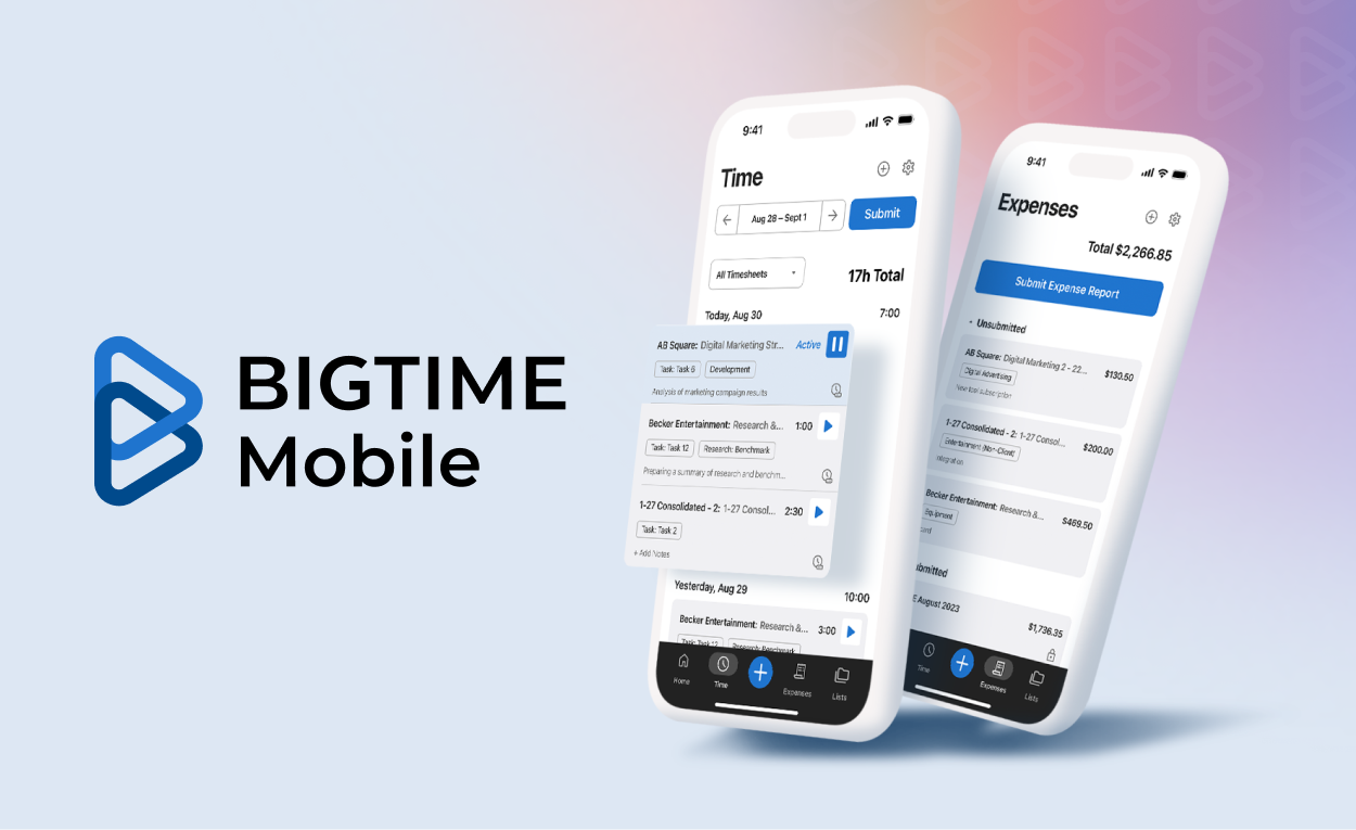
BigTime Mobile was in urgent need of modernization. As the primary tool for entering time and expenses on the go, the app had fallen behind in both performance and usability. I was the UX Director for the full redesign and rebuild, from early concepting with a vendor partner (DEPT) to an internal team handoff. The initiative centered on re-establishing user trust, improving reliability, and creating a more intuitive mobile experience. Legacy app ratings were at 2.7 stars (the lowest among competitors), and customer trust was slipping.
The Challenge
The legacy app suffered from performance issues, confusing workflows, and missing features that impacted users in critical day-to-day tasks.
Key Focus Areas:
Resolving Outdated UI and ambiguous workflows
Reducing Frequent bugs and broken receipt uploads
Improved feature parity with the web platform
Improve low app store ratings (2.7 Stars)
Migrate users to the new experience
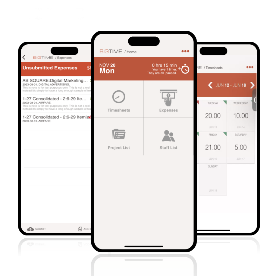
BigTime Legacy App
The Approach
Working with an external vendor, we worked as fully embedded teams for discovery and development. Here are some processes and areas that we discovered along the way:
Discovery: Listening, Not Guessing
We began by grounding the redesign in customer feedback and support data. I worked with the Program Managers to develop a series of discovery sessions (over 30), surveys, and usability sessions to pinpoint specific frustrations with mobile time entry, timers, and expense submission.
Stabilize, Then Rebuild
We quickly patched the legacy apps to fix urgent issues, address App Store violations, and rebuild user trust. Then, we kicked off a parallel effort to rebuild the apps from the ground up. The process started with an intense two-week sprint to diagnose every structural weakness.
UX Improvements with Measured Impact
The new patterns remained familiar, but we introduced meaningful enhancements to ease pain points. These included simplified timer controls, offline access, improved receipt handling, and homepage action items designed to streamline daily use.
Vendor Engagement & Agile Iteration
We worked closely with DEPT during the first 60% of the project. We moved quickly from early prototypes to working builds, focusing on component-level improvements that could be validated with users.
Transition to Internal Team Ownership
About halfway through, we began transitioning the work to our newly built internal team. I remained involved through multiple iterations and sprints to introduce it formally to the Google and Apple App stores.
Marketing and GTM Collaboration
We partnered with the marketing team to craft clear messaging, create video assets, visual assets, storytelling, and overview videos that resonated with both existing customers and prospective users.
The Result
We sucessfully rebuilt each screen with simplified UX patterns. In this process we also developed a new mobile-first design system.
2.7 ★ → 4.4 ★ Rating
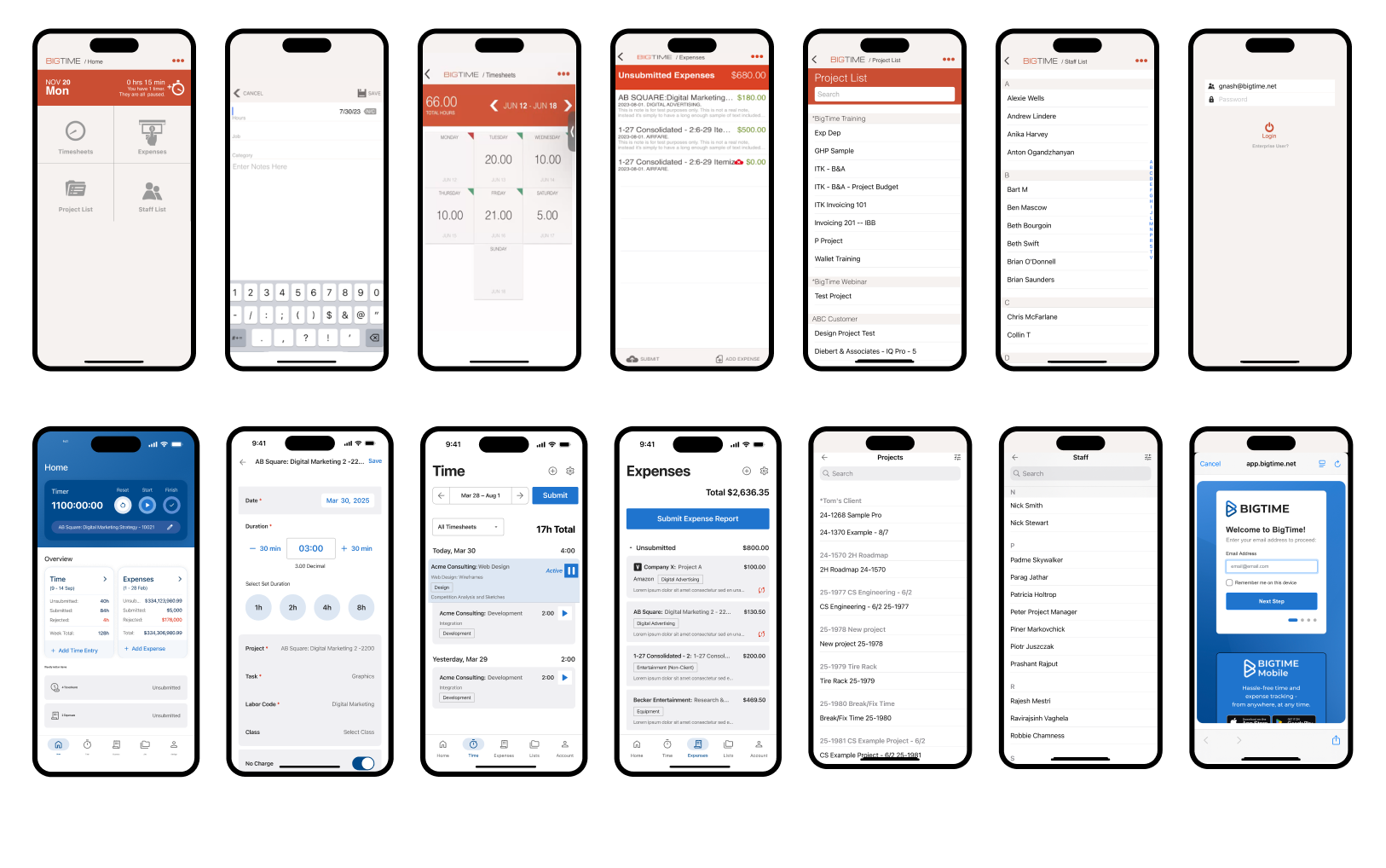
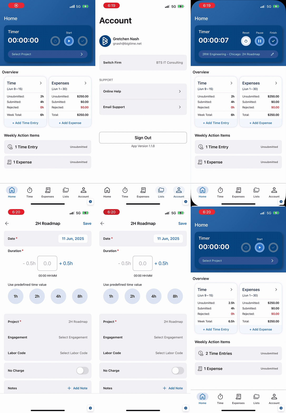
Key Mobile Refinements
Updated UI with improved component consistency & patterns
Credit card expense tagging, time duration increments
Time & Expense resubmission flows
One-tap timers and offline access
A redesigned home screen focused on quick actions
A full native rebuild for iOS and Android

Ongoing Improvements
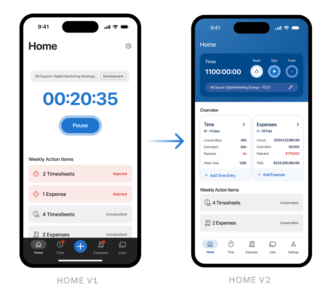
After launch, we closely tracked adoption metrics and gathered user feedback, which revealed opportunities to enhance the home screen, time entry, and expense experiences. Customers needed faster access to key actions and clearer visibility into their schedules.
I led some focused research sprints with UX Designers to validate new concepts for a more actionable, glanceable home screen. We prioritized quick access to timers and task summaries, and tested calendar-based time entry views to improve control and planning. With these updates, we also updated the navigation for quicker access to Settings. These updates are part of our ongoing, research-driven roadmap to streamline workflows and better support BigTime's customer base.
Read more:
Other Works
Lenovo & Motorola QiraUX & Interactive
Echo Show - Home SystemUX & Interactive
Amazon - Alexa Design SystemUX & Interactive
BigTime MobileUX & Interactive
BigTime's Navigation SystemUX & Interactive
BigTime Release Notes & RoadmapUX & Interactive
FireTV - Ambient BackgroundsUX & Interactive
Amazon - Alexa WidgetsUX & Interactive
BigTime AI AssistantUX & Interactive
Alexa Personality ResponsesUX & Interactive
BigTime TimersUX & Interactive
BigTime Report CenterUX & Interactive
A New Design SystemUX & Interactive
Crafting Integrations Across 6 Product SystemsUX & Interactive
A Modernized Login SystemUX & Interactive
Modernizing a Legacy PlatformUX & Interactive
Amazon Fashion App ConceptUX & Interactive
Joyfull BodyworkPrint, Branding
TriCan HealthPrint, Branding
Marni & GibranPrint, Branding
Spencer & MathiasPrint, Branding
Amazon - AmazeConPrint, Branding
Susie's Horse ClubPrint, Branding
Righter ManorPrint, Branding
White Label Finance AppUX & Interactive
Amazon - CORE ConferencePrint, Branding
Productivity Watch ConceptUX & Interactive
Seattle Sky ColorsPrint
Wedding Branding SuitePrint, Branding
Amazon - Accessibility Awareness MonthPrint, Illustration
Dear GretchenBook, Print, Photography
Minus The Bear - Infinity OverheadMusic, Vinyl, Lettering, Print
Minus The Bear - Lost LovesMusic, Vinyl, Lettering, Print
Minus The Bear - ApparelPrint, Illustration
Aleve - Pain ReliefMotion, Storyboards
Minute Maid - NaturalsMotion, Storyboards
Stride Rite - Glitzy PetsStoryboards, Commercial
Coca-Cola - TastemakerInteractive, Motion, Storyboards
Washington LotteryMotion, Stroyboards
Minus The Bear - Record Store DayMusic, Vinyl, Lettering, Print
April Showers Bring May FlowersTypography, Print, Font
Honey BearPrint, Illustration
Coca-Cola - AhhMotion, Illustration
Clorox - Fashionably CleanMotion, Storyboards
J-Power - Powered by NatureMotion, Storyboards
Taco Bell - Doritos LocosMotion, Storyboards, Photography
Shoe Carnival - HolidaysMotion, Storyboards
Sony - The Color of SportMotion, Storyboards
Chase SapphireMotion, Storyboards
Nike: Here I amMotion, Storyboards
AudiMotion, Storyboards
T.Rowe PriceMotion, Storyboards
Betsey JohnsonMotion, Storyboards
Ross: A Brand New DayMotion, Storyboards
Shell: ScientificMotion, Storyboards
Honda Odyssey: Soul TrainMotion, Storyboards
SunsilkMotion, Storyboards
Pretty PicturesLogo, Print, Branding
Motion StateLogo, Print, Branding
Love & HeartbreakPrint, Photography
BigTime Annual KickoffPrint, Illustration
PeoplemoverMusic, Lettering, Print
Wrapped ApparelIllustration, Apparel
Sweet ToothPrint, Illustration
Vacationer - MerchLettering, Print
The Wise OwlLogo, Print, Branding
Death to the Passive MindsetLettering
BloomLettering, Drawing
Happy AccidentsPrint, Illustration
Minus The Bear - BloomLettering, Drawing
Heck Em'Lettering, Digital
Boss BabeLettering, Digital
Say Hi!Lettering, Marker
Floral "E"Lettering, Drawing
Chiseled "C"Lettering, Digital
Curly "A"Lettering, Pencil, Pen
Be BetterLettering, Marker
SeattleLettering, Digital
Forever FriendLettering, Digital
Totally Awesome!Lettering, Digital
Love, Wilderness.Lettering, Digital
Blood Peach BelliniLettering, Marker
Consistency is KeyLettering, Marker
Dapper TIL DeathLettering, Marker
Duotone "D"Lettering, Digital
Easy Does ItLettering, Digital
FlowingLettering, Marker
Take a Break!Lettering, Digital
Thrifty BitchLettering, Digital
PreciousLettering, Marker
Weak SauceLettering, Marker
The Food Pun SeriesLettering, Digital
Forged in OakLettering, Branding
TranquilLettering, Marker
Hell YeahLettering, Digital
Stanford AerobicsLettering, Print
Clocks SystemUX & Interactive, Illustration
