A New Design System
\
Transforming BigTime into a Unified Design System
UX Director | Made at BigTime, 2023-25

The Team:
UX Director & Product Lead: Gretchen Nash
UX Designers: Jan Starzyk, Emily Lee, Bartosz Ujma, Waldek Strzelczyk, Monika Gontarz
Development: Angel Rodriguez, Will Thomas, Ani Singh, Jakub Rekas, Bartek Harmaczyński
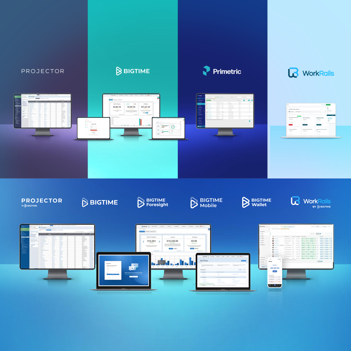
Over 20 years of continuous development on a custom Angular-based system left BigTime’s expanding UI with a patchwork of styles and patterns, lacking a unified system and guidelines. As the product matured, the absence of a centralized design system became more apparent: slowing development, creating inconsistencies, and limiting scalability.
Seeing a clear opportunity to simplify design and engineering workflows, I partnered with two front-end engineering leads and our UX team to kickstart a front end development team. We formed a focused “tiger team” that was united around a shared goal: to build a modern, scalable design system that could evolve alongside our products. This system would streamline development times, create consistency, and empower teams across the organization to deliver cohesive, high-quality user experiences
What started as a grassroots project has now become our platform’s design backbone.
Our Approach

With a nimble team, we kept things practical by folding design system work into active projects so we could make steady progress, stay visible, and show value as we went. Here are some ways that we started the project:
Start with active roadmaps: We aligned design system updates into live roadmap features, ensuring steady investment along the way.
Align on tools: We adopted Figma for design specs, Storybook + Chromatic for documentation and visual testing.
Create shared visibility: A front-end-development JIRA board helped us track weekly component needs and team capacity.
Scale asynchronously: Slack and async workflows supported communication across time zones and teams.
Team Ceremonies: We conducted bi-weekly team sprint planning, demos, and retrospectives to refine our processes and capacity planning.
This phased approach let us build momentum, deliver value early, and stress-test the components in production across environments.
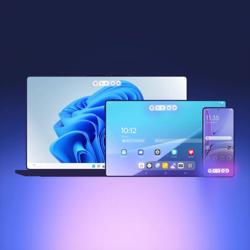
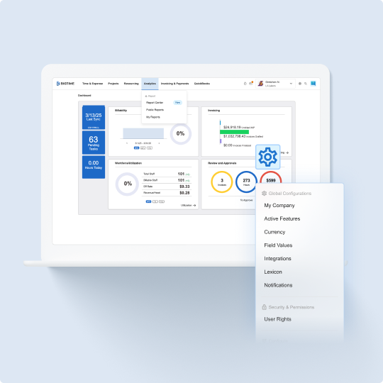
Design System Foundations

We refreshed our core design language with flexibility and scalability in mind:
New Tokens: Colors, typography, spacing, elevation
Foundational Components: Buttons, inputs, grids, status indicators, tables
Color Themes: Vibrant, dark mode, and an AI palette
Expanded Variants: Size, state, interaction, accessibility-states
This sytem is designed to grow over time, evolving alongside the product as new patterns and features are added to the roadmap.


Breakdown of Components & Variants:
Our design system includes around 40 core components and nearly 200 documented variants, forming a scalable and reliable foundation for product development. By standardizing interaction patterns and visual styles, it reduces tech debt, accelerates implementation, and ensures a cohesive user experience across platforms.

Enabling Scale Through a Consultative Model

What began as a focused effort by a four-person tiger team is now scaling through a consultative support model:
Partnering with developers to surface reusable components
Offering best practices guidance, documentation, and Figma resources
Code and design reviews for consistency and architecture
Encouraging new contributions from both design and engineering team.
This shift empowered teams to move faster without reinventing the wheel, while staying aligned in both UX patterns and technical architecture. It also gave designers and developers a shared sense of ownership and a framework for contribution.
UX & Visual Refinements

Beyond system infrastructure, each release was a chance to elevate the user experience through small, but high-impact areas:
Responsive breakpoints were added across web, mobile, and tablet screens
Defined UX copy rules for clarity and consistency
Improved visual feedback and navigation models
Integrated UX motion to the component library for the first time
Evolved brand expression through refined spacing, typography, and iconography
Established system-wide rules for things like: primary button placements, table alignment, modal behavior, panels, UX writing, lexicon, and tooltips.
Outcomes & Impact

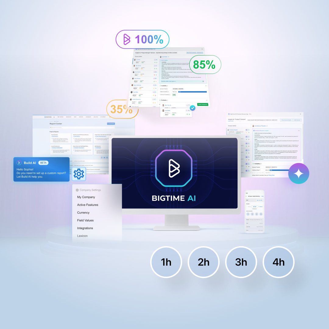
What started as a small passion project is driving consistency and efficiency. Every new release now leverages the design system, which cuts design and development time in half and eliminates guesswork. There is no more ambiguity around colors, components, and patterns. Features like dark mode, once hardcoded and fragmented, are now easily implemented in minutes through system-level theming rules.
Beyond improved speed and scale, the system also deepened collaboration and trust between design and engineering. It gave us a shared language and a centralized toolkit that balances flexibility with guardrails. Today, the design system is not only widely adopted, it’s actively maintained and extended through a consultative model that empowers teams to build with quality & confidence.
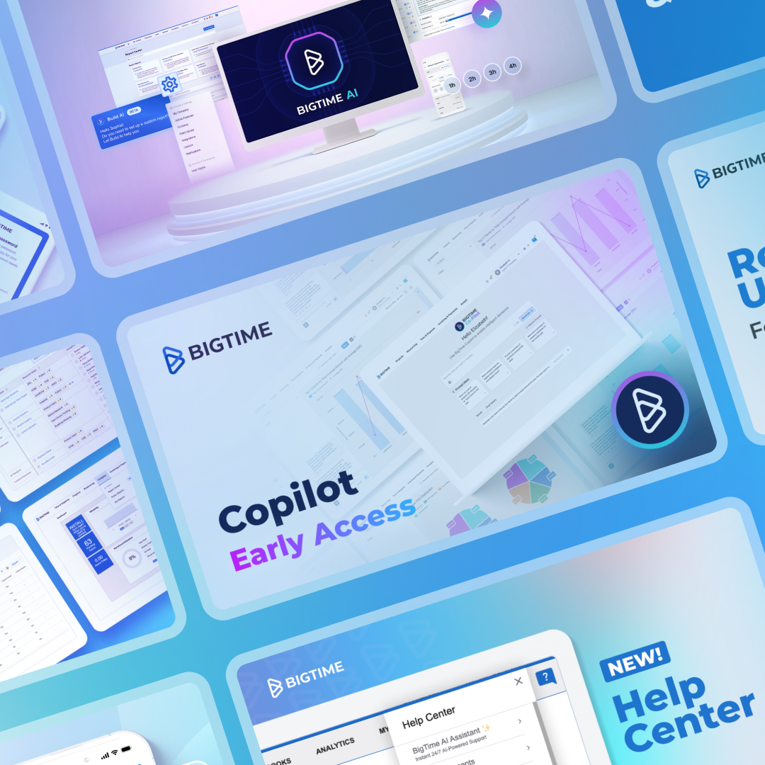
Other Works
Lenovo & Motorola QiraUX & Interactive
Echo Show - Home SystemUX & Interactive
Amazon - Alexa Design SystemUX & Interactive
BigTime MobileUX & Interactive
BigTime's Navigation SystemUX & Interactive
BigTime Release Notes & RoadmapUX & Interactive
FireTV - Ambient BackgroundsUX & Interactive
Amazon - Alexa WidgetsUX & Interactive
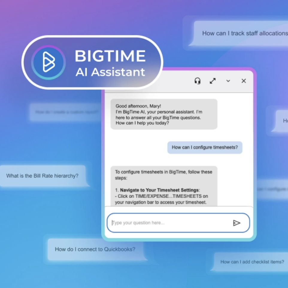
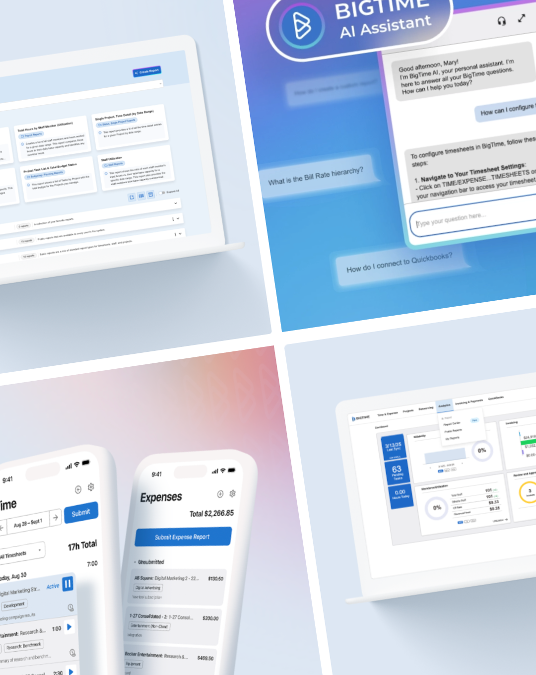
BigTime AI AssistantUX & Interactive

Alexa Personality ResponsesUX & Interactive
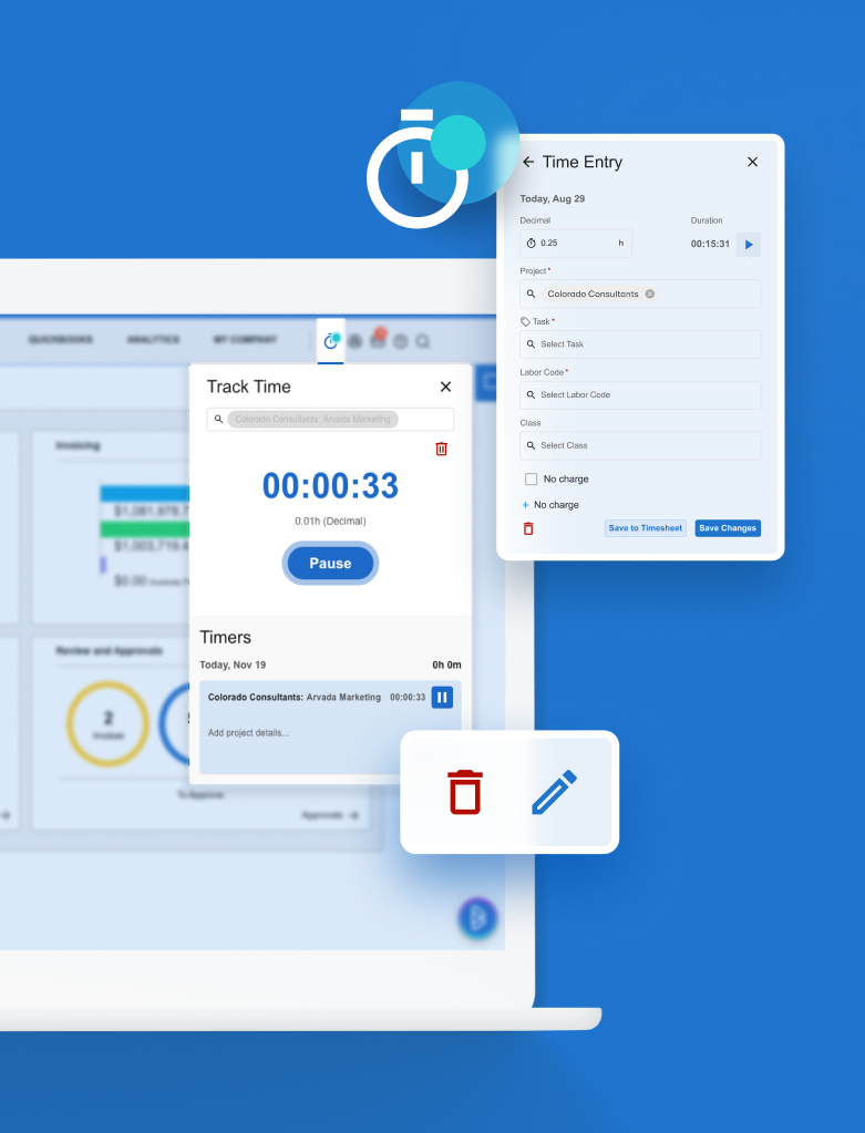
BigTime TimersUX & Interactive
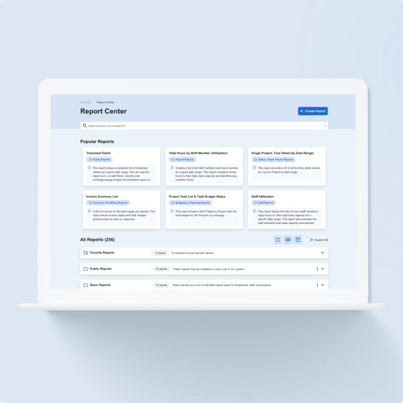
BigTime Report CenterUX & Interactive
A New Design SystemUX & Interactive
Crafting Integrations Across 6 Product SystemsUX & Interactive
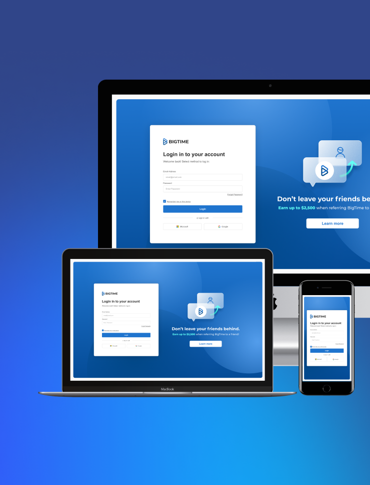
A Modernized Login SystemUX & Interactive
Modernizing a Legacy PlatformUX & Interactive
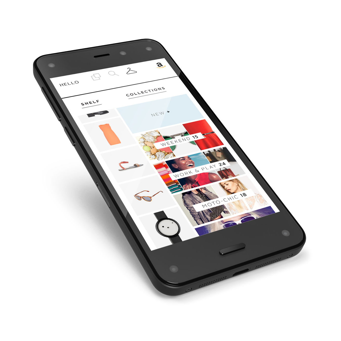
Amazon Fashion App ConceptUX & Interactive
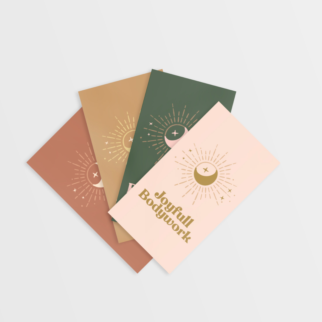
Joyfull BodyworkPrint, Branding
TriCan HealthPrint, Branding
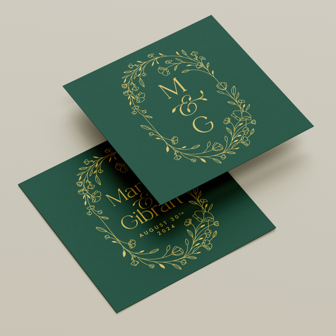
Marni & GibranPrint, Branding
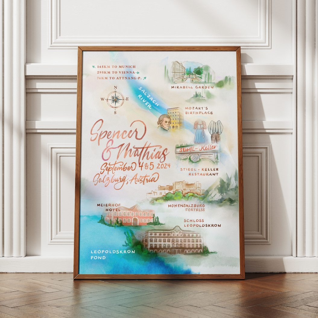
Spencer & MathiasPrint, Branding
Amazon - AmazeConPrint, Branding
Susie's Horse ClubPrint, Branding
Righter ManorPrint, Branding
White Label Finance AppUX & Interactive
Amazon - CORE ConferencePrint, Branding
Productivity Watch ConceptUX & Interactive

Seattle Sky ColorsPrint
Wedding Branding SuitePrint, Branding
Amazon - Accessibility Awareness MonthPrint, Illustration
Dear GretchenBook, Print, Photography
Minus The Bear - Infinity OverheadMusic, Vinyl, Lettering, Print
Minus The Bear - Lost LovesMusic, Vinyl, Lettering, Print
Minus The Bear - ApparelPrint, Illustration
Aleve - Pain ReliefMotion, Storyboards
Minute Maid - NaturalsMotion, Storyboards
Stride Rite - Glitzy PetsStoryboards, Commercial
Coca-Cola - TastemakerInteractive, Motion, Storyboards
Washington LotteryMotion, Stroyboards

Minus The Bear - Record Store DayMusic, Vinyl, Lettering, Print

April Showers Bring May FlowersTypography, Print, Font
Honey BearPrint, Illustration
Coca-Cola - AhhMotion, Illustration
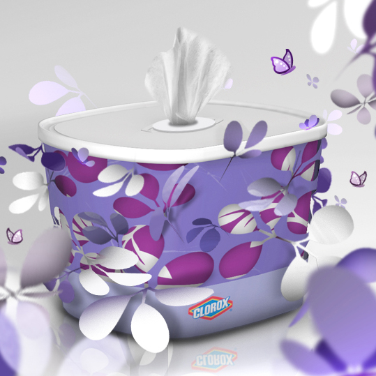
Clorox - Fashionably CleanMotion, Storyboards
J-Power - Powered by NatureMotion, Storyboards
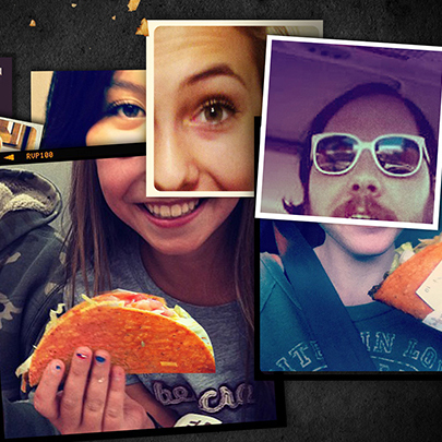
Taco Bell - Doritos LocosMotion, Storyboards, Photography
Shoe Carnival - HolidaysMotion, Storyboards
Sony - The Color of SportMotion, Storyboards
Chase SapphireMotion, Storyboards
Nike: Here I amMotion, Storyboards
AudiMotion, Storyboards
T.Rowe PriceMotion, Storyboards
Betsey JohnsonMotion, Storyboards
Ross: A Brand New DayMotion, Storyboards
Shell: ScientificMotion, Storyboards
Honda Odyssey: Soul TrainMotion, Storyboards
SunsilkMotion, Storyboards
Pretty PicturesLogo, Print, Branding
Motion StateLogo, Print, Branding
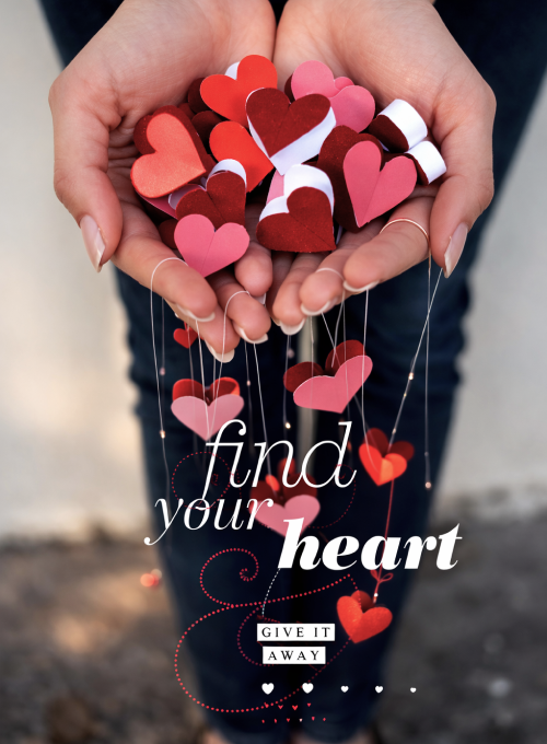
Love & HeartbreakPrint, Photography
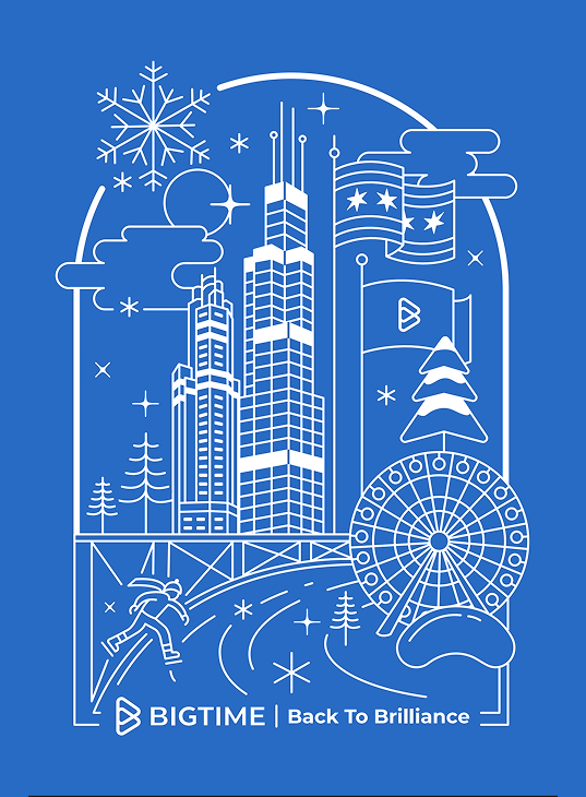
BigTime Annual KickoffPrint, Illustration
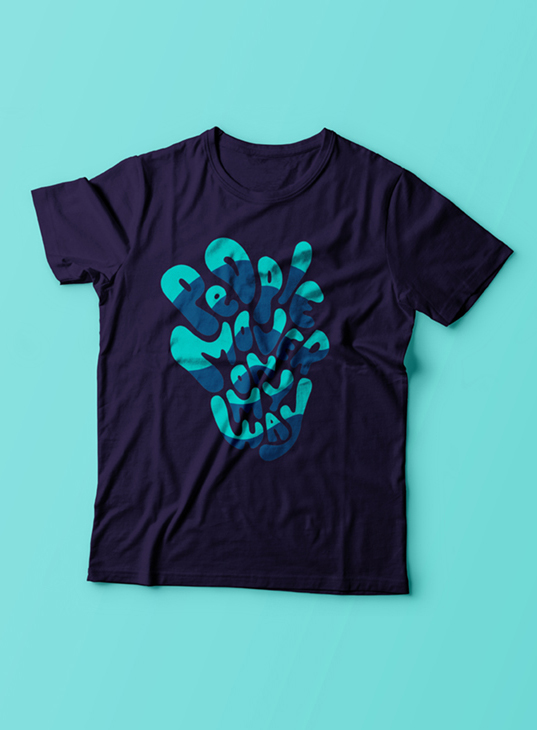
PeoplemoverMusic, Lettering, Print

Wrapped ApparelIllustration, Apparel
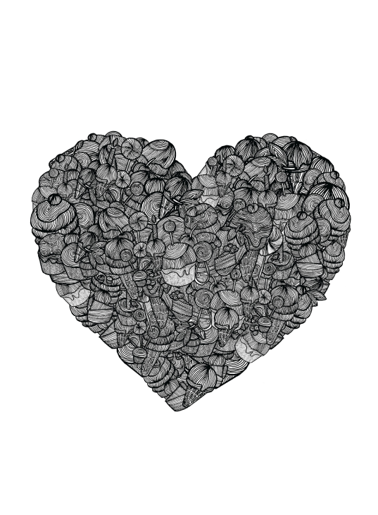
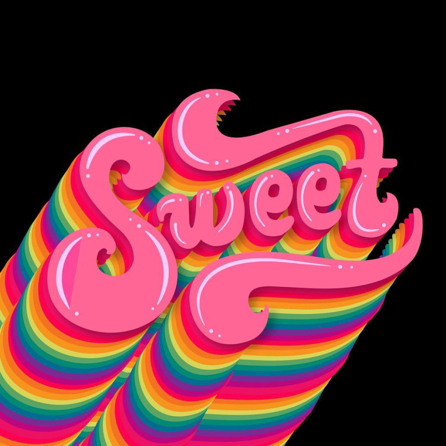
Sweet ToothPrint, Illustration
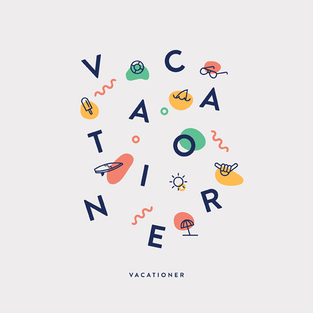
Vacationer - MerchLettering, Print

The Wise OwlLogo, Print, Branding
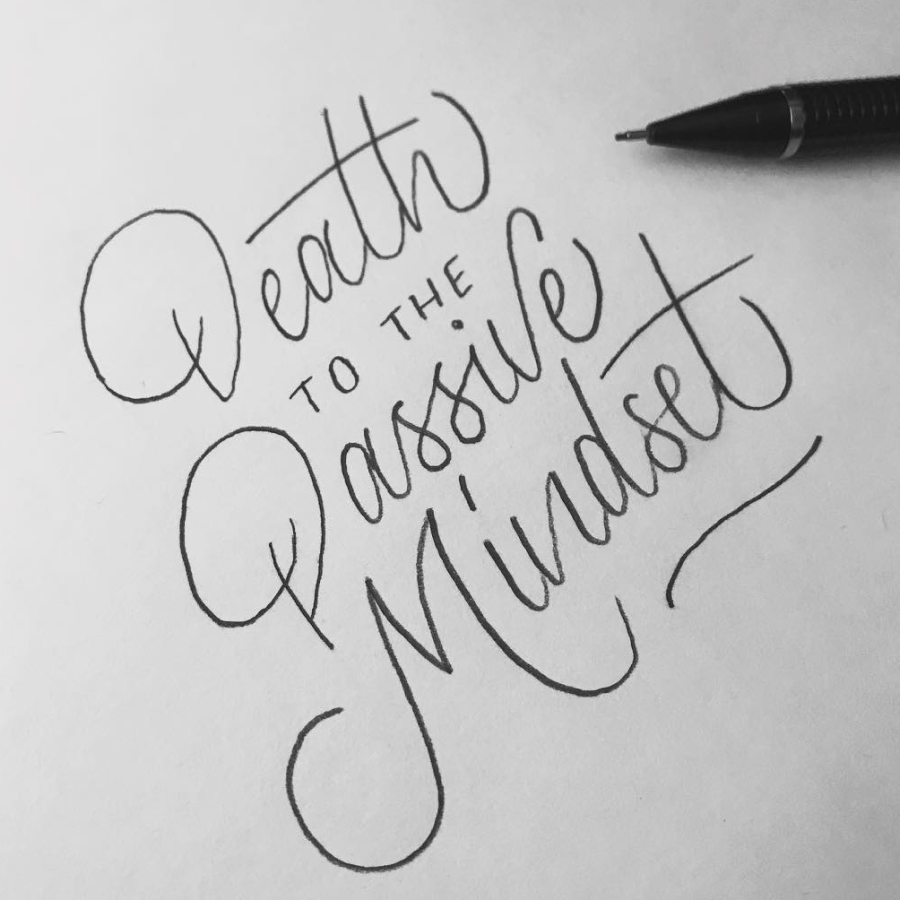
Death to the Passive MindsetLettering
BloomLettering, Drawing
Happy AccidentsPrint, Illustration
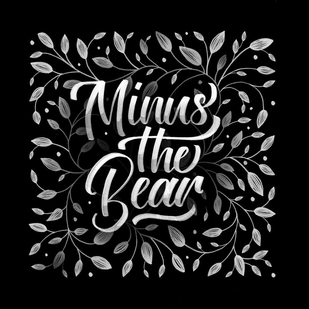
Minus The Bear - BloomLettering, Drawing
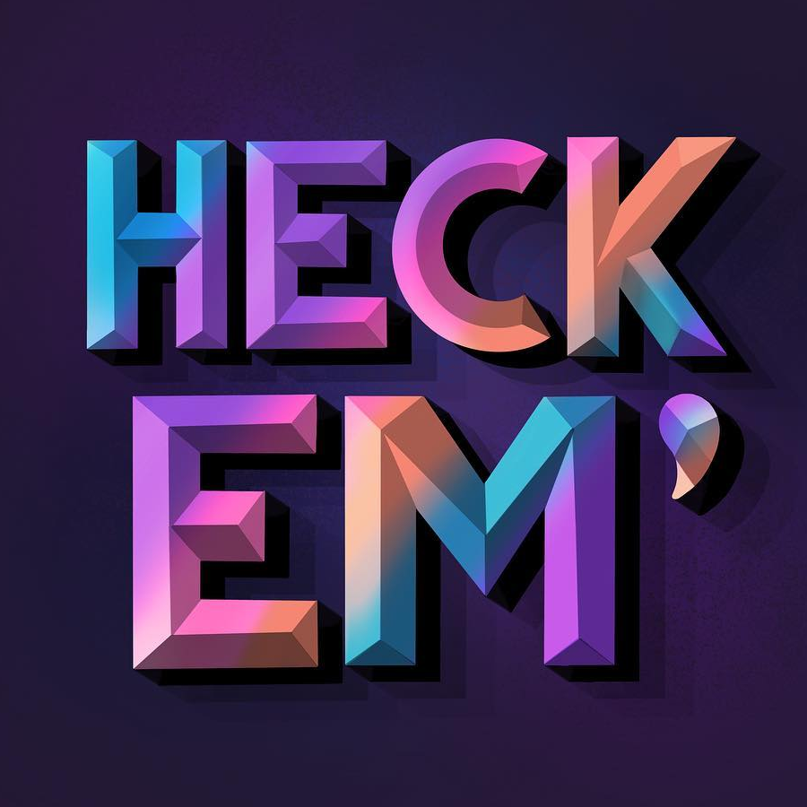
Heck Em'Lettering, Digital
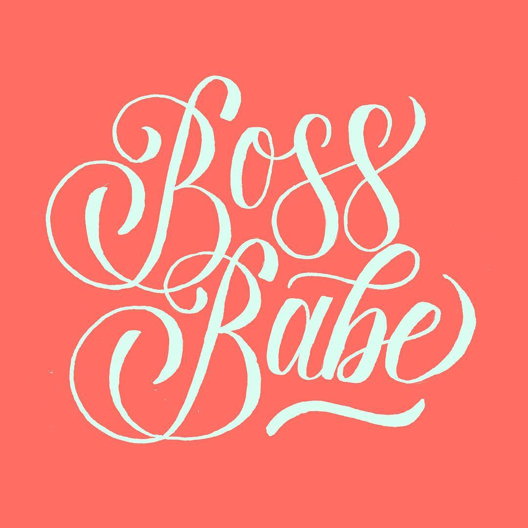
Boss BabeLettering, Digital
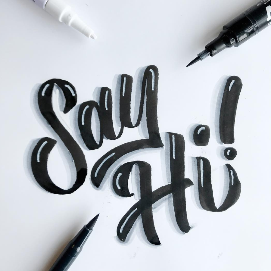
Say Hi!Lettering, Marker
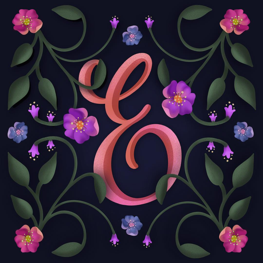
Floral "E"Lettering, Drawing
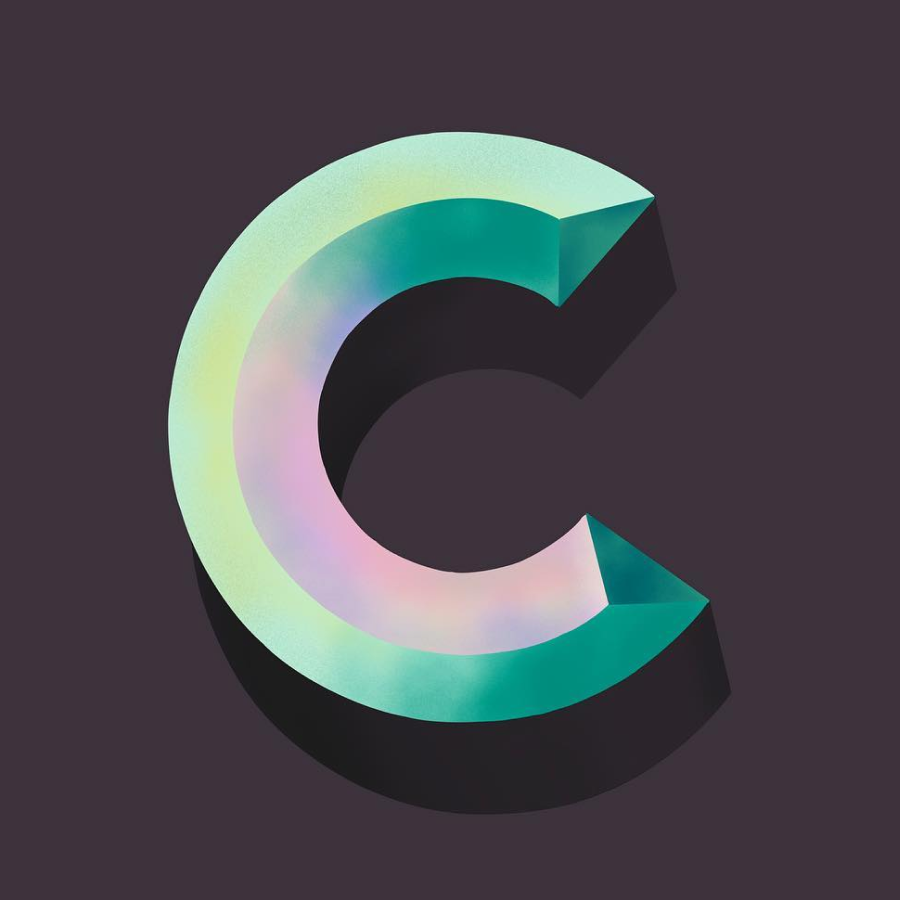
Chiseled "C"Lettering, Digital
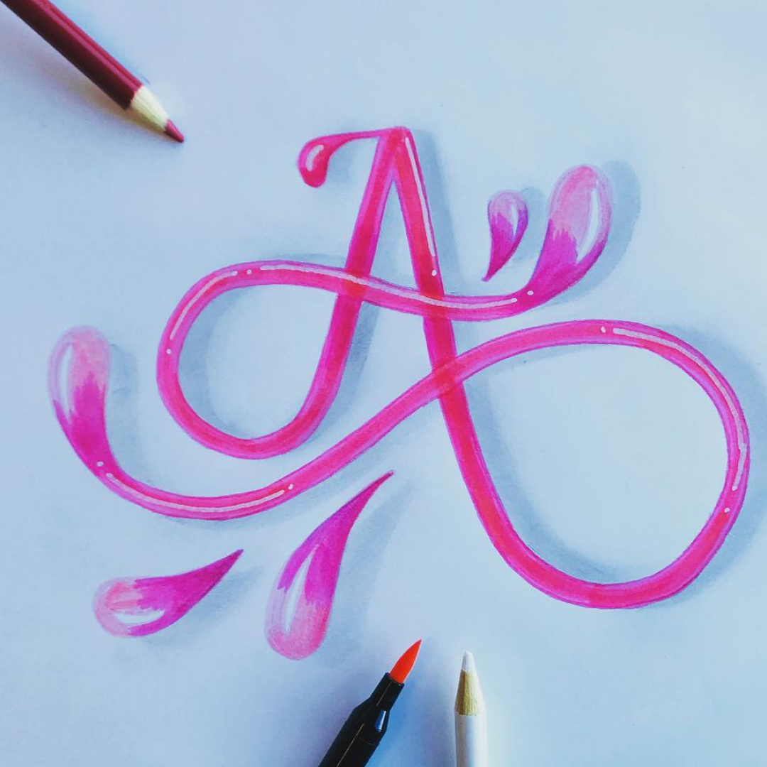
Curly "A"Lettering, Pencil, Pen
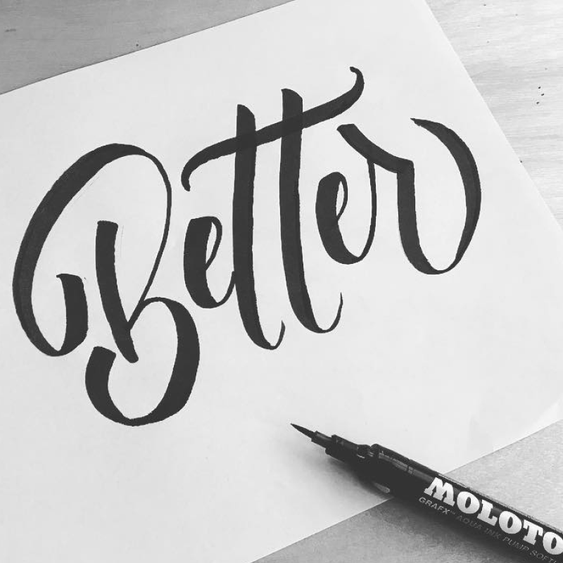
Be BetterLettering, Marker
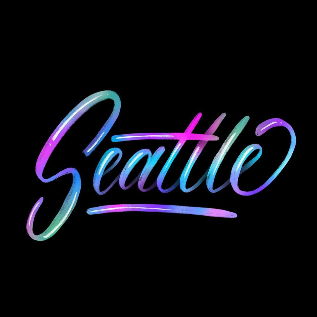
SeattleLettering, Digital
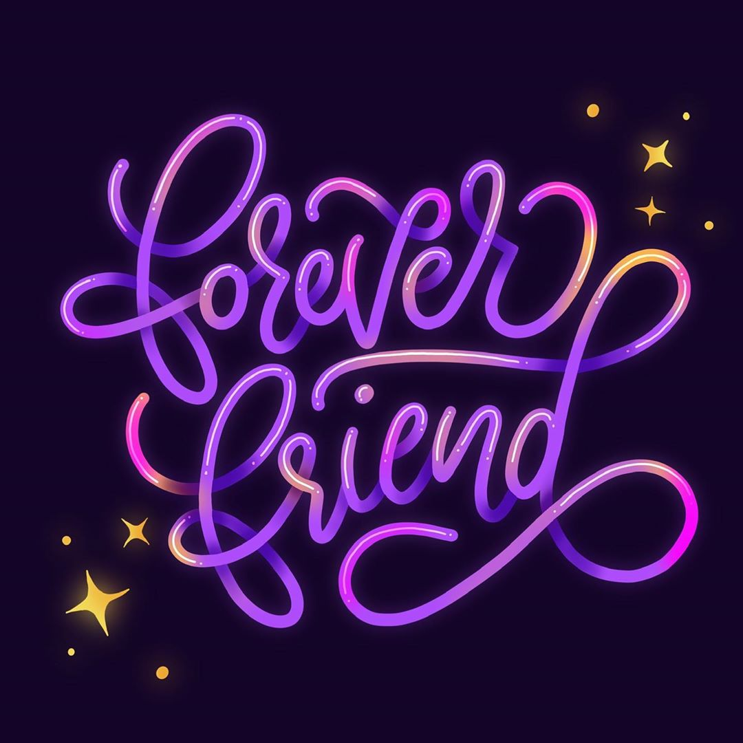
Forever FriendLettering, Digital
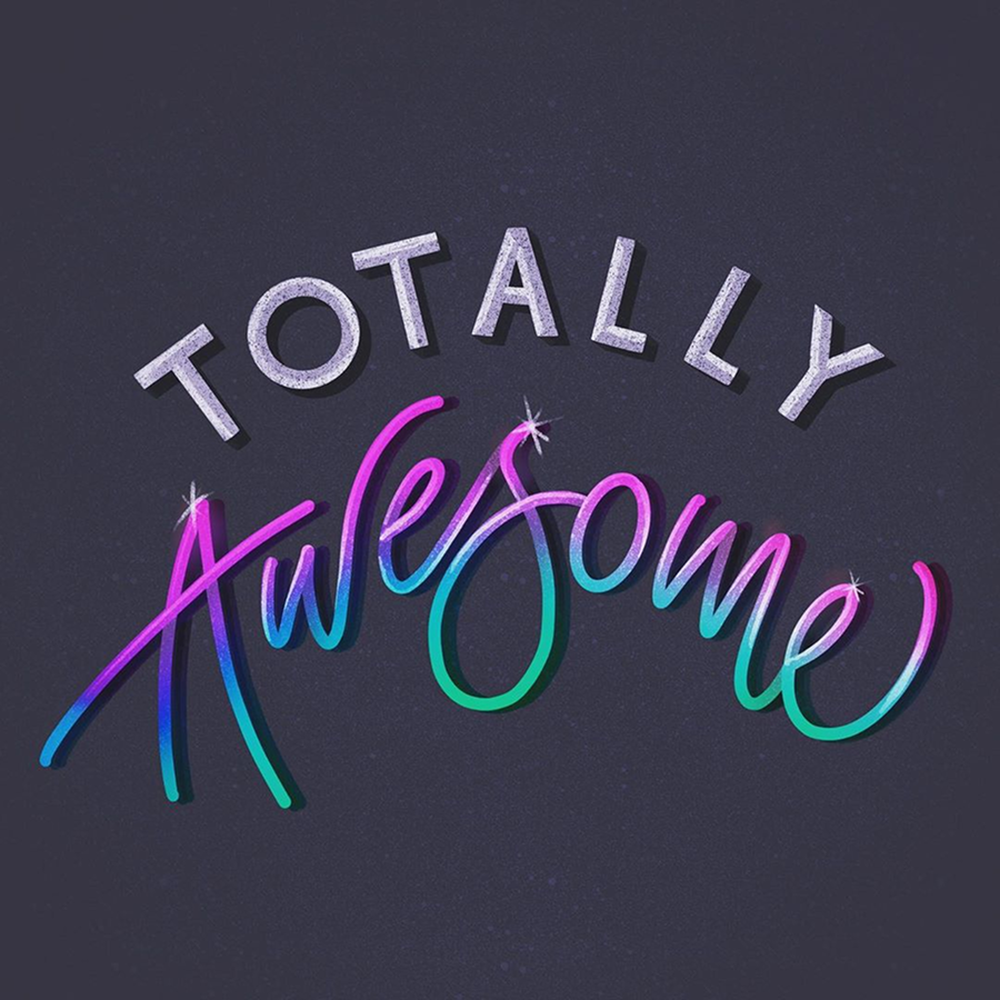
Totally Awesome!Lettering, Digital
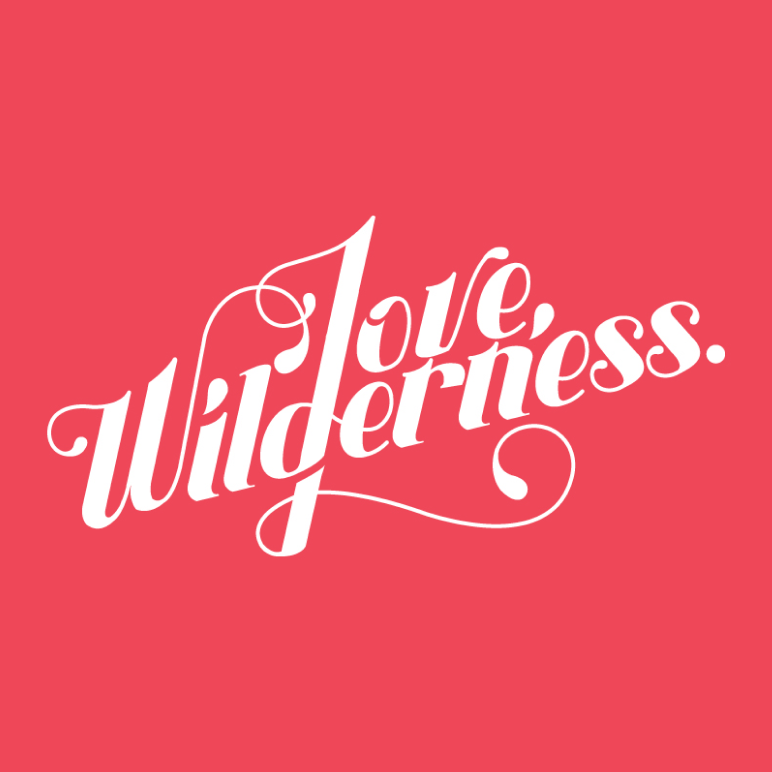
Love, Wilderness.Lettering, Digital
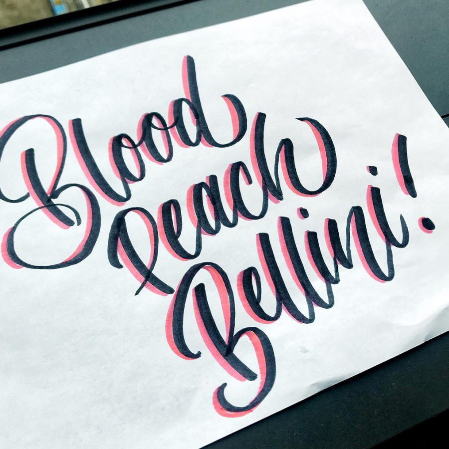
Blood Peach BelliniLettering, Marker
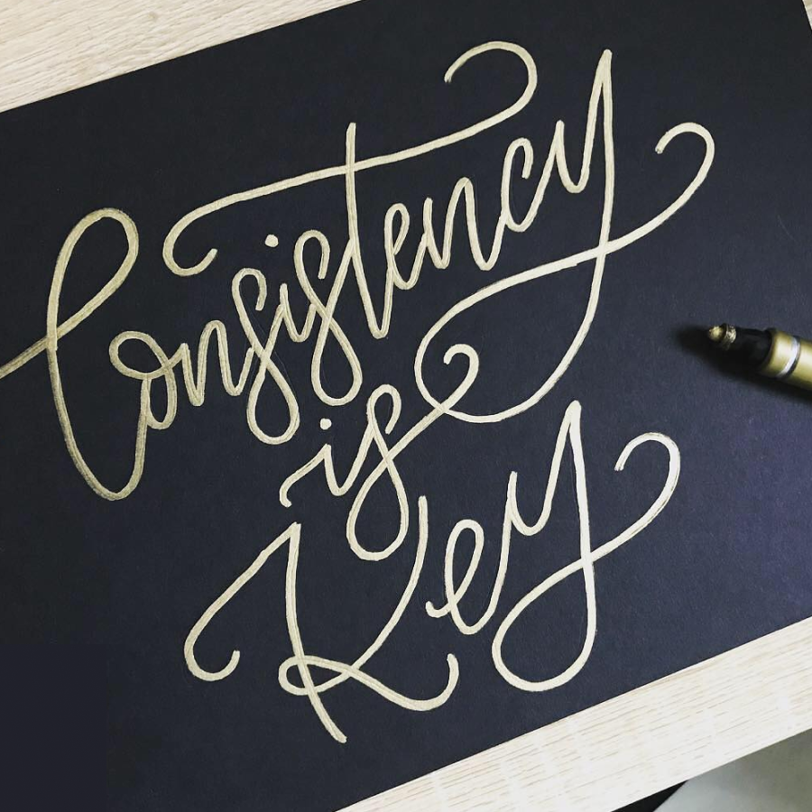
Consistency is KeyLettering, Marker
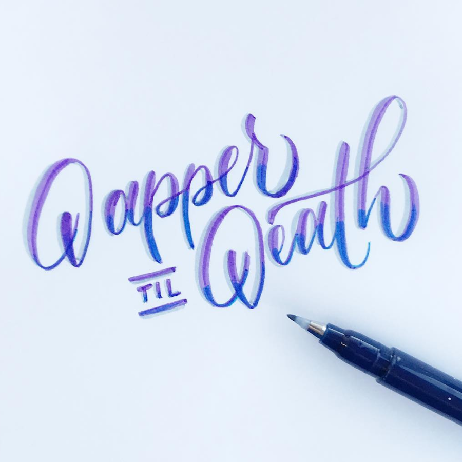
Dapper TIL DeathLettering, Marker
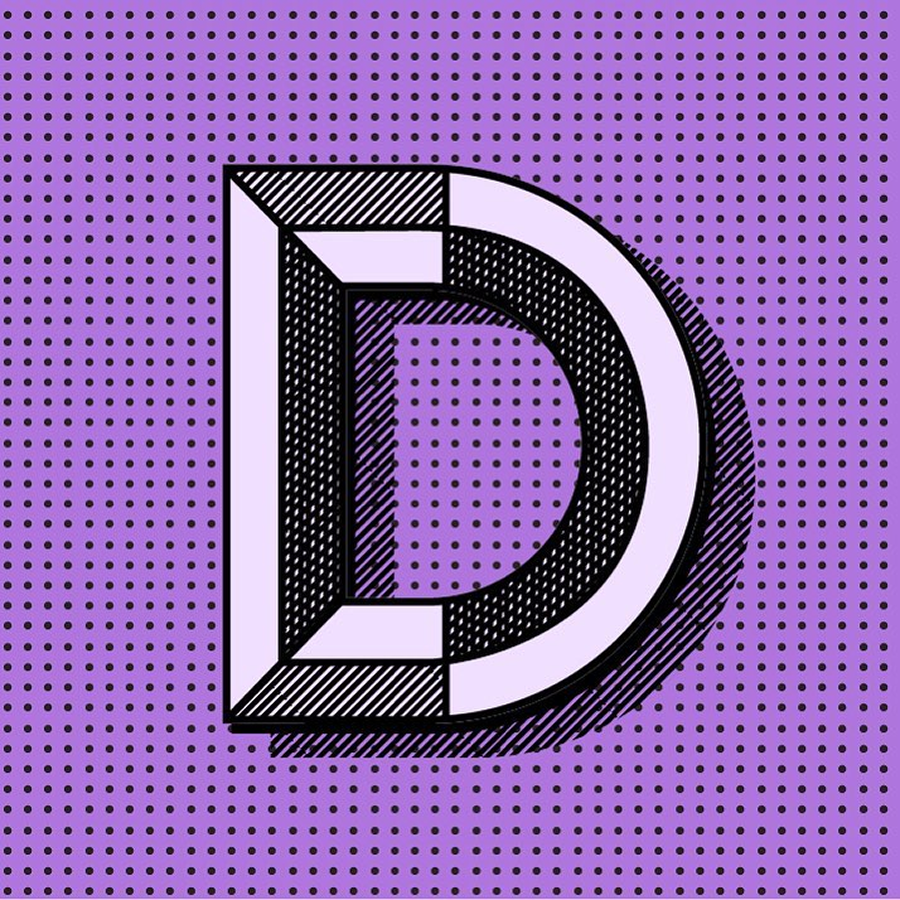
Duotone "D"Lettering, Digital
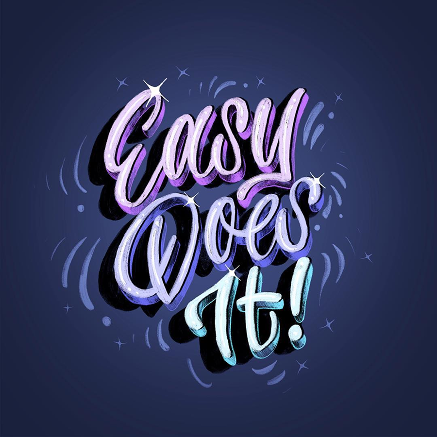
Easy Does ItLettering, Digital
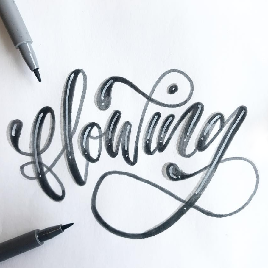
FlowingLettering, Marker
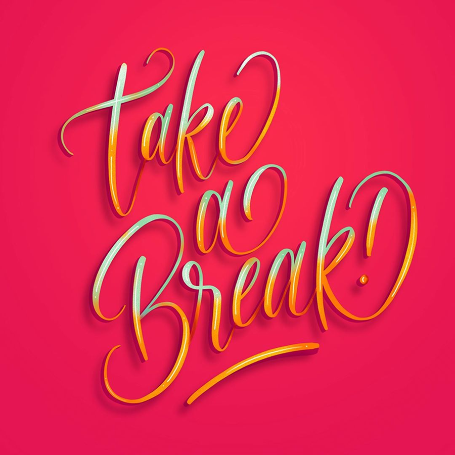
Take a Break!Lettering, Digital

Thrifty BitchLettering, Digital
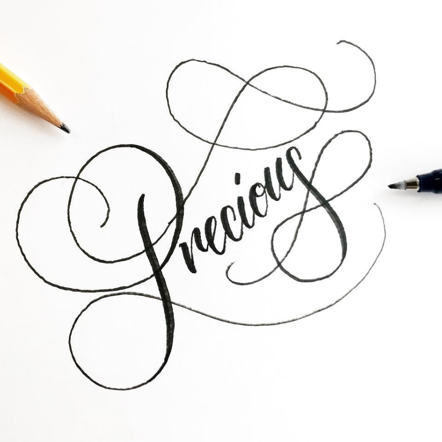
PreciousLettering, Marker
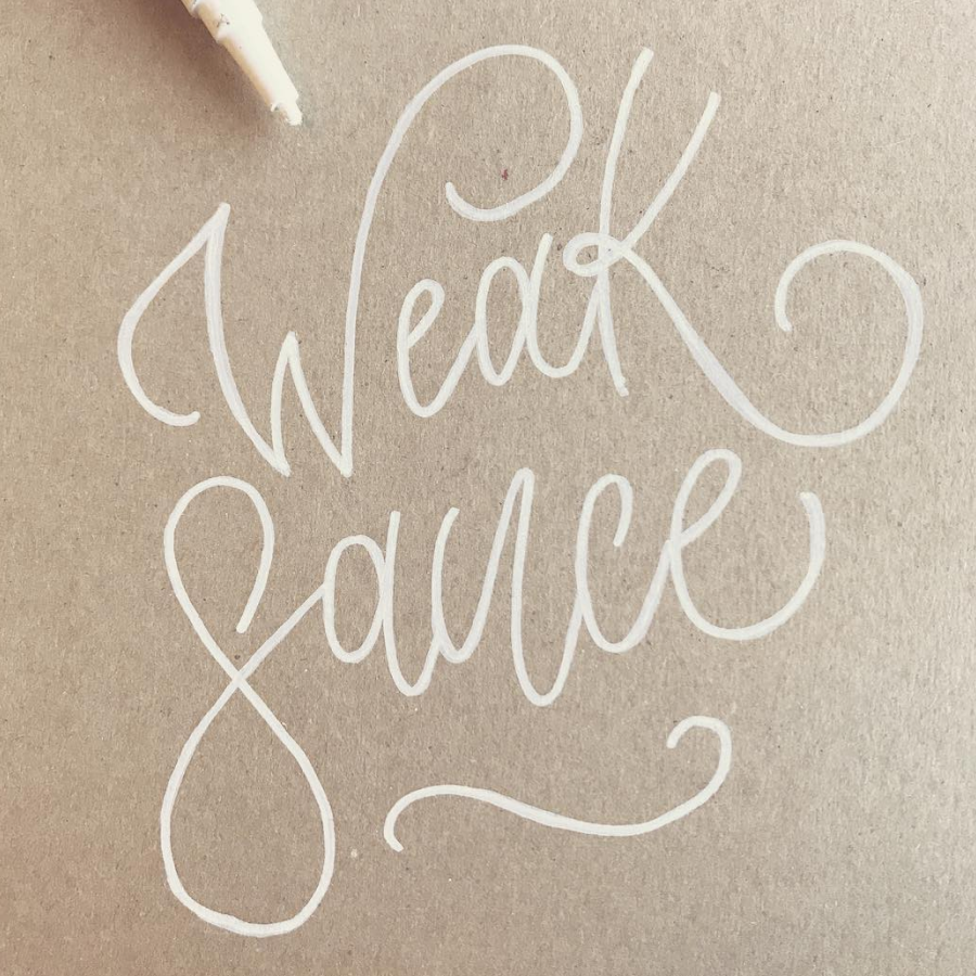
Weak SauceLettering, Marker
The Food Pun SeriesLettering, Digital
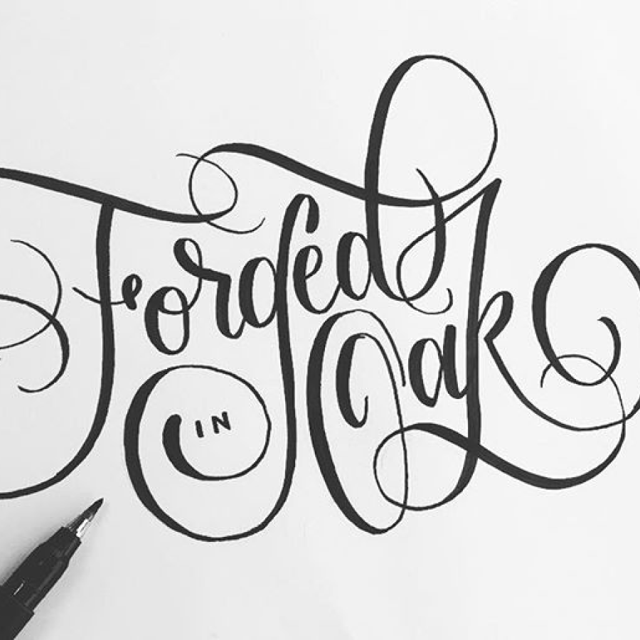
Forged in OakLettering, Branding
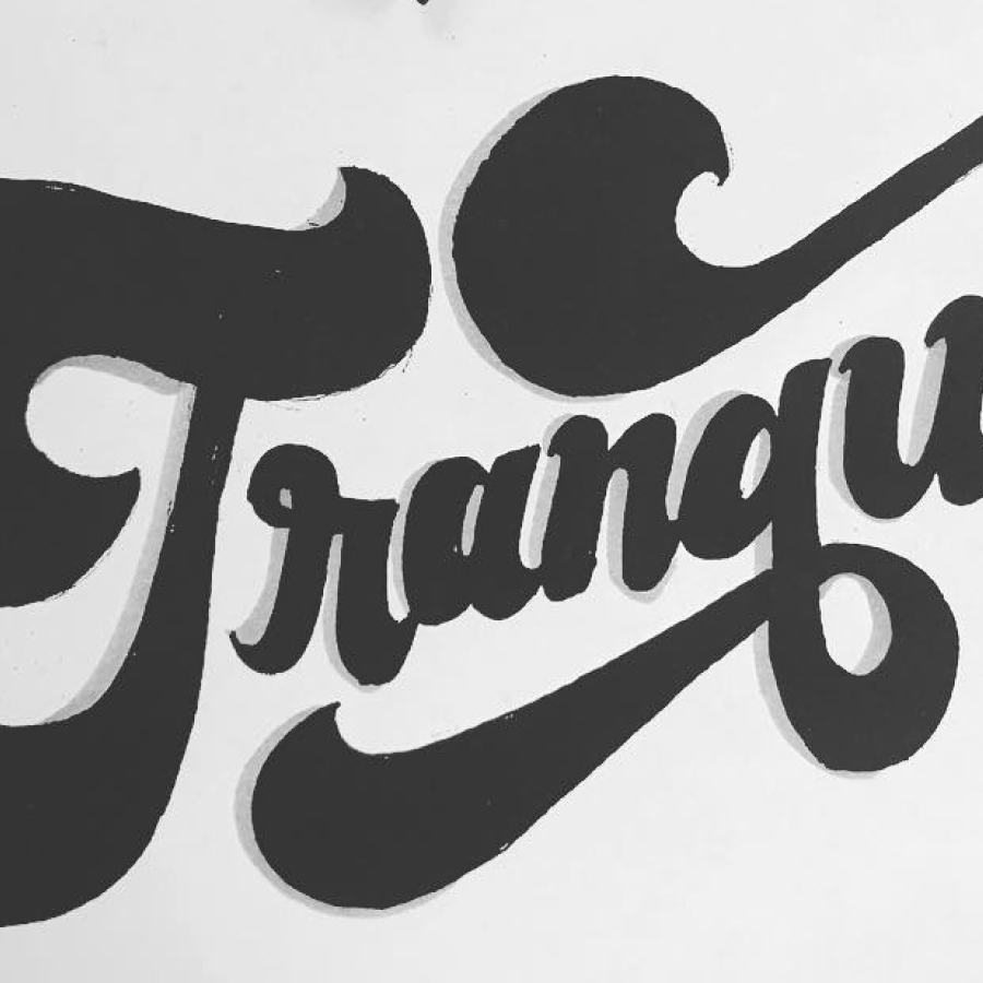
TranquilLettering, Marker
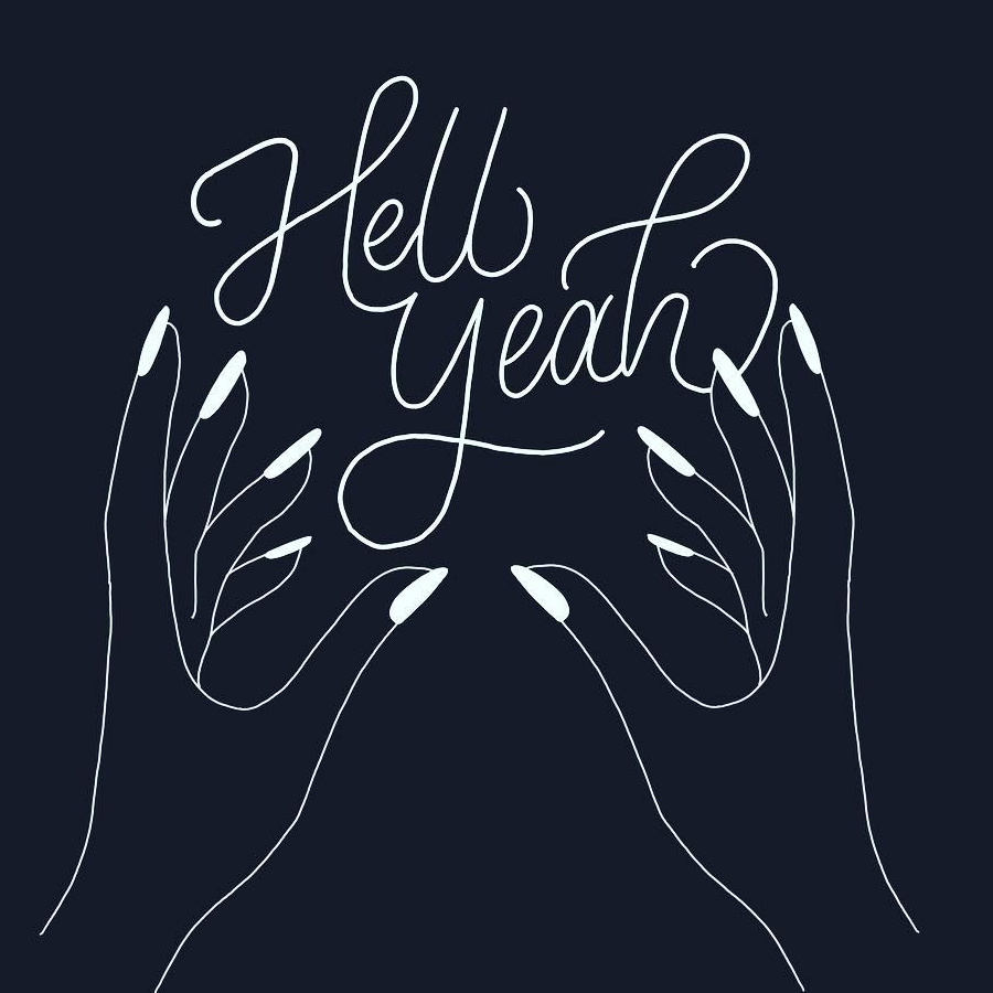
Hell YeahLettering, Digital
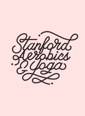
Stanford AerobicsLettering, Print
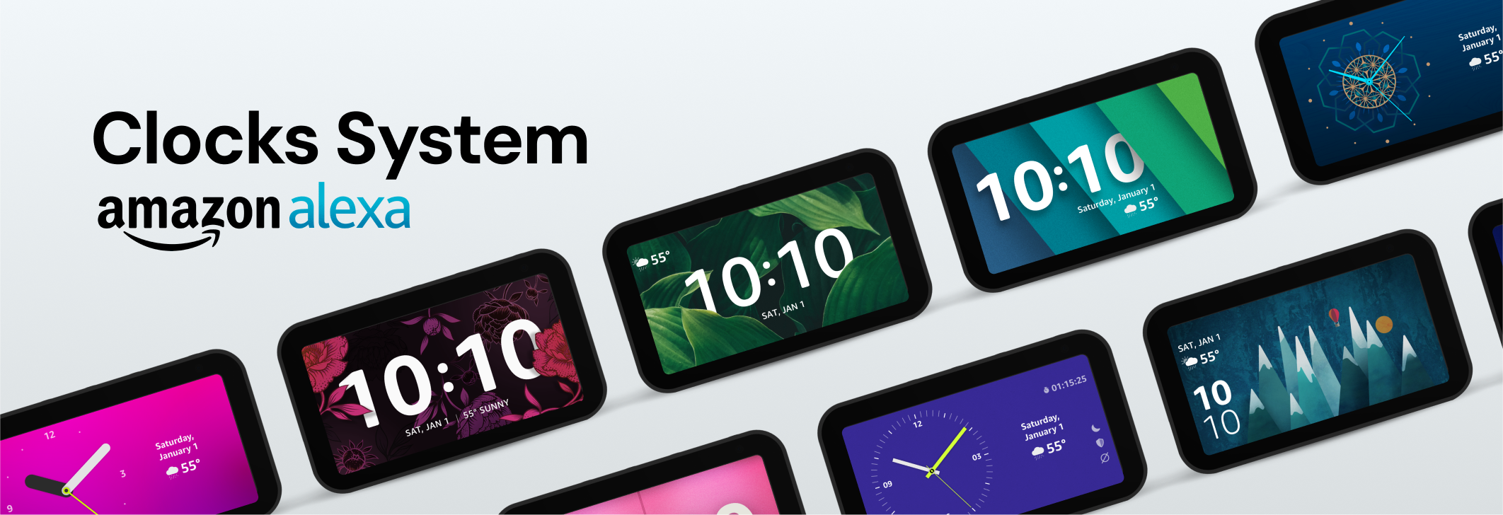
Clocks SystemUX & Interactive, Illustration