BigTime Timers
Modernizing The Time Tracking Experience
Redesigning Timers from the Ground Up
UX Director | Made at BigTime, 2023-24

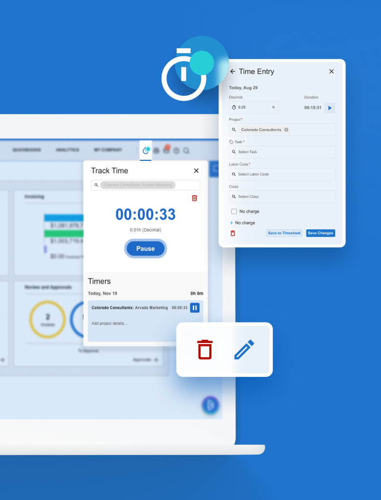
New Timers Experience
The Team:
UX Director: Gretchen Nash
UX Designers: Emily Lee, Monika Gontarz, Vanessa Li (DEPT)
Developers: Will Thomas, Angel Rodriguez, Jon Cain
QA: Stan Meland, Joseph Luat, Kristine Hermasado, Peter Nero
Product Education: Dalia Sadowska
Product Manager: Mary Pat Holtrop, Kevin Kim
In 2024, BigTime set out to rebuild the desktop timer experience, one of the most relied-upon yet under-optimized features in its web application. Accurate time tracking is at the heart of BigTime's value proposition: and staffers need to log their time accurately to ensure projects are billed correctly to maintain profitability. With this, timers are not just a feature: they are a foundational component of operational success for thousands of customers. Yet the existing timers experience was frustratingly clunky, visually outdated, and rife with usability pain points that undercut this essential workflow.
Legacy Timer Workflow

Beginning Research Audit
The previous timer workflow was riddled with friction: multi-click actions, confusing buttons, and poor visual cues led customers to abandon timers altogether or make frequent errors. Customers repeatedly voiced frustrations about the cognitive and manual burden of a feature that should be seamless. I started with a research audit of current state to familiarize myself and the cross-functional team, so that we all understood the foundation to work forwards from.
Gathering Customer Feedback
Customers shared some candid feedback in Pendo and discovery sessions that underscored the urgency of redesign:
"Very annoying to have to click twice to get a timer to start."
"The timer button says 'Start' but just opens the timer. Very confusing."
"Would love to be able to input a start time if I forgot to start it."
"No indication that a timer is running. I forget them all the time."
Primary Goals & Opportunities
Increase customer satisfaction and adoption of the timer feature.
Create a modern, intuitive interface that aligns with the mobile experience.
Reduce friction in everyday timer actions: starting, editing, pausing, and saving.
Improve time entry completion and customer education.
We identified three primary areas for improvement:
Clunky & Clicky: Basic timer actions required multiple, unclear clicks.
Lack of Modernization: The interface felt outdated and inconsistent with newer product features.
Poor Visibility & Education: Customers often forgot active timers and found interface elements and labels confusing.
Design Strategy

Before (Top), and After Modernization
We began with a comprehensive UX audit and competitive benchmarking, which informed a strategy focused on simplifying key actions, improving running timer visibility, and modernizing the experience.

Key UX improvements included:
Implementing one-click actions for starting and pausing timers.
Adding a pulsing nav indicator to show active timers.
Adding a animated visual tooltip on hover
Aligning time formatting with timesheet standards.
Using progressive disclosure to reduce form clutter.
Introducing modern UI components aligned with the mobile app.
Adding clarity to UX writing and labels
Iterative Refinements

Pulsing Dot Indicator - A key UX improvement
Throughout development, we maintained an iterative design process, leveraging feedback loops with both internal stakeholders and real customers. Early versions revealed confusion around button placement and labeling, especially around actions like "Save to Timesheet" and "Remove All", which led to a redesign of those interaction patterns.
UX copy was refined to reduce ambiguity. Button labels were updated for clarity (e.g., switching from "Start" to "Open Timer" where appropriate), and instructional text was made more concise and actionable.
Backend improvements were also essential. The development team rebuilt how time entries were captured and stored, added new APIs, and made architecture improvements that allowed more transparent save flows and confirmation states.
Features like "Save to Timesheet" versus "Save Changes" gave customers the ability to choose whether to log an entry immediately or save it for later, accommodating different workflows. Midnight roll-over was added to ensure accurate logging across days, and timer switching was streamlined so customers could easily toggle between tasks without data loss.
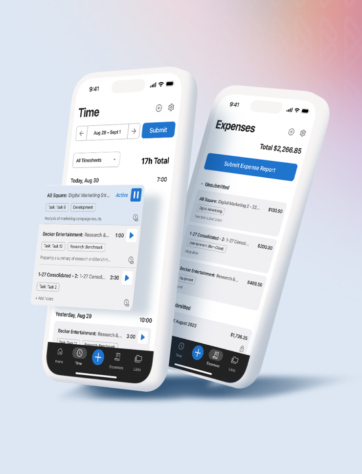
Feature Highlights

Other feature highlights after development include:
Built in React for faster performance, reduced tech debt, and scalability.
New onboarding flow concepts for first-time customers.
Support for manual time entry, editing, and day-specific adjustments.
Auto-population of recent entries and automatic midnight rollover.
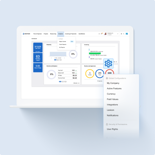
Enhanced timer management and visibility in the top nav.
Influencing Design System Investment

Confluence Tracking Board for Component Intake & Documentation
This project also served as the first major initiative to influence the development of BigTime's shared component library. Every element of the new timer interface was built in React for the first time using modular, reusable components. This paved the way for greater design consistency and development efficiency across the platform.
As the design system product lead, I helped define and track acceptance criteria for each new component with the dev and design team, ensuring they met product needs and could be leveraged across multiple workflows. These shared components like text input, search patterns, popovers are now refined and battle-tested through the Timers project. They now form a scalable foundation for future features and products, as well as across the development team for full stack use.

Vibrant & Dark Mode
The Impact

The redesign has delivered measurable improvements:
Fewer support tickets related to timers.
Positive feedback on clarity and ease-of-use.
Increased adoption and daily usage across customer segments.
Redesigning the timers experience at BigTime was more than a UI facelift, it was a strategic overhaul of a mission-critical feature. By listening closely to our customers, benchmarking best-in-class tools, and focusing on clarity, speed, and flexibility, we turned a source of daily frustration into a frictionless, modern workflow. The new timer experience reflected our commitment to customer-centered design and continuous product evolution.
What's Next
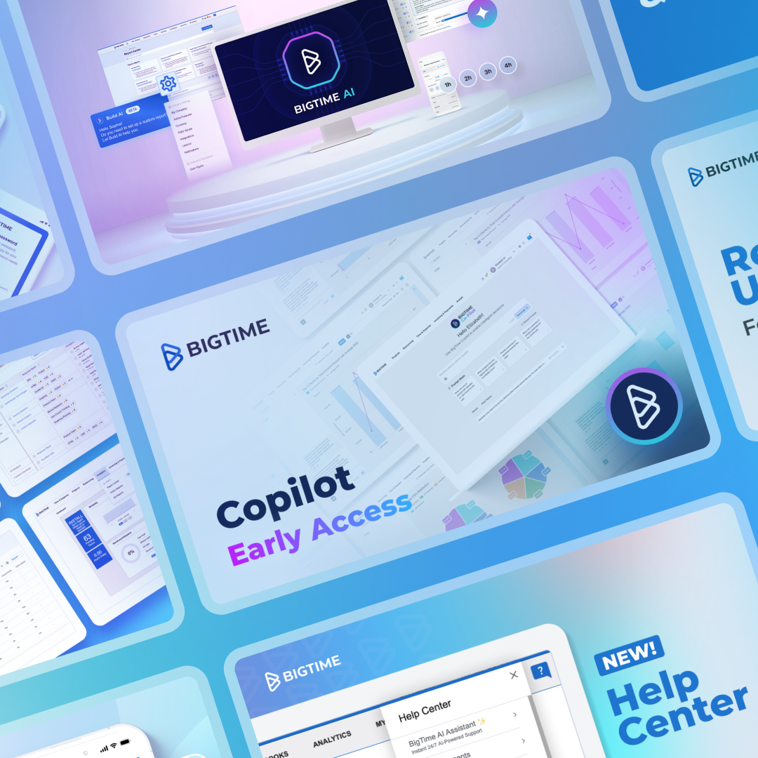
Timers are rolling out to General Availability thoughout 2025 and currently in Early Access at BigTime, you can learn more in the help article below.
Other Works
Lenovo & Motorola QiraUX & Interactive
Echo Show - Home SystemUX & Interactive

Amazon - Alexa Design SystemUX & Interactive
BigTime MobileUX & Interactive
BigTime's Navigation SystemUX & Interactive
BigTime Release Notes & RoadmapUX & Interactive
FireTV - Ambient BackgroundsUX & Interactive
Amazon - Alexa WidgetsUX & Interactive
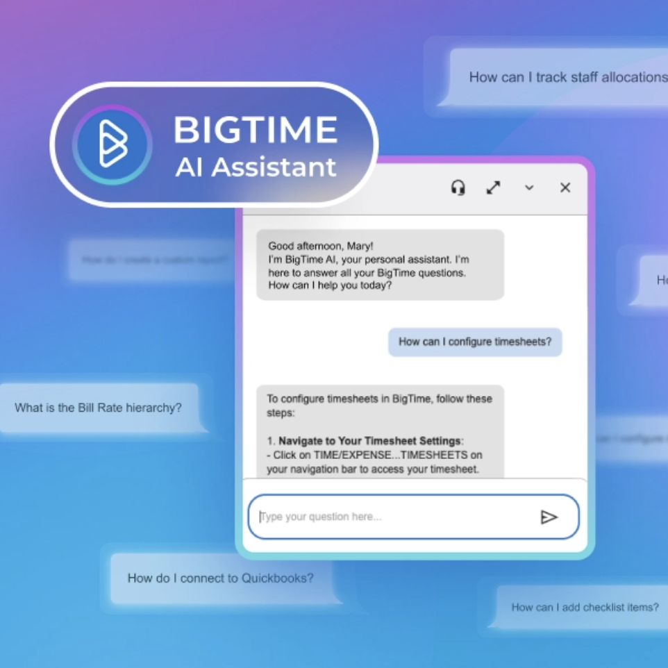
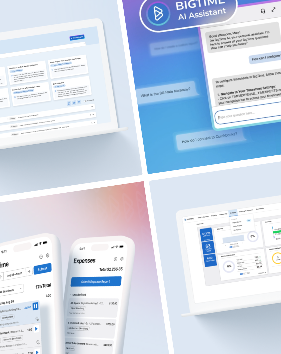
BigTime AI AssistantUX & Interactive

Alexa Personality ResponsesUX & Interactive
BigTime TimersUX & Interactive
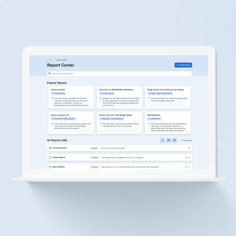
BigTime Report CenterUX & Interactive
A New Design SystemUX & Interactive
Crafting Integrations Across 6 Product SystemsUX & Interactive
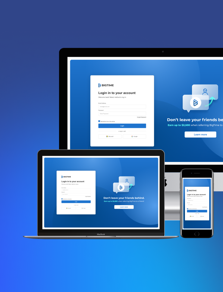
A Modernized Login SystemUX & Interactive
Modernizing a Legacy PlatformUX & Interactive
Amazon Fashion App ConceptUX & Interactive
Joyfull BodyworkPrint, Branding
TriCan HealthPrint, Branding
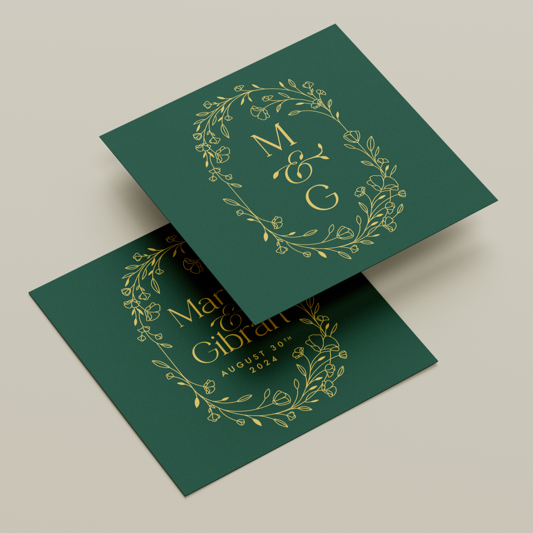
Marni & GibranPrint, Branding
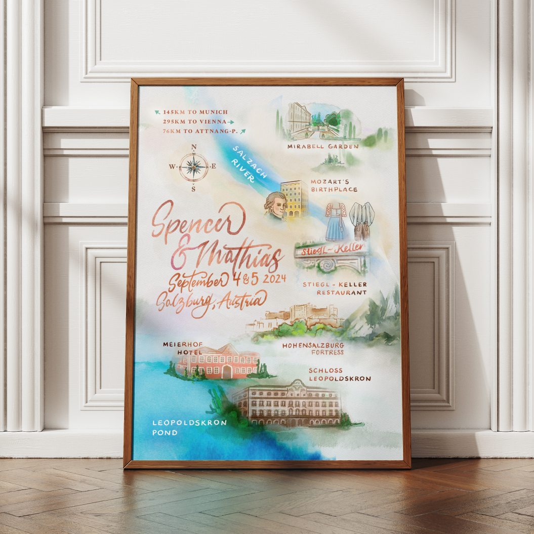
Spencer & MathiasPrint, Branding
Amazon - AmazeConPrint, Branding
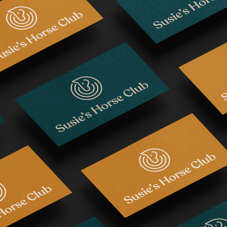
Susie's Horse ClubPrint, Branding
Righter ManorPrint, Branding
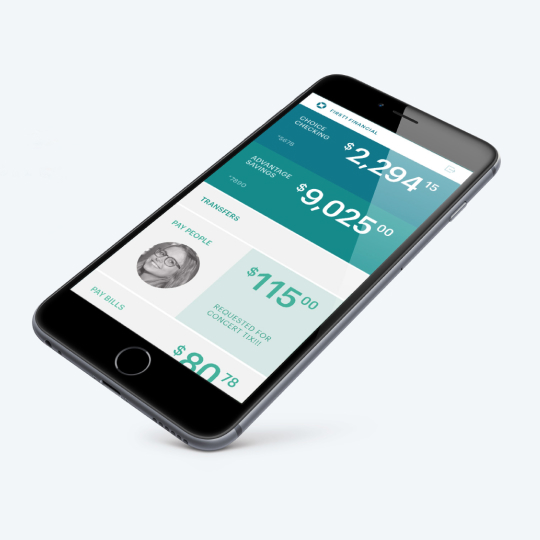
White Label Finance AppUX & Interactive
Amazon - CORE ConferencePrint, Branding
Productivity Watch ConceptUX & Interactive

Seattle Sky ColorsPrint
Wedding Branding SuitePrint, Branding
Amazon - Accessibility Awareness MonthPrint, Illustration
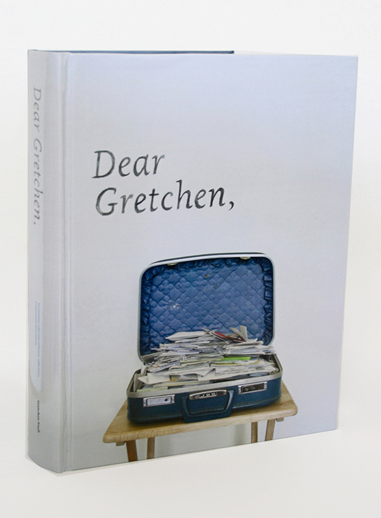
Dear GretchenBook, Print, Photography
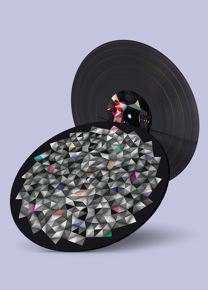
Minus The Bear - Infinity OverheadMusic, Vinyl, Lettering, Print

Minus The Bear - Lost LovesMusic, Vinyl, Lettering, Print
Minus The Bear - ApparelPrint, Illustration
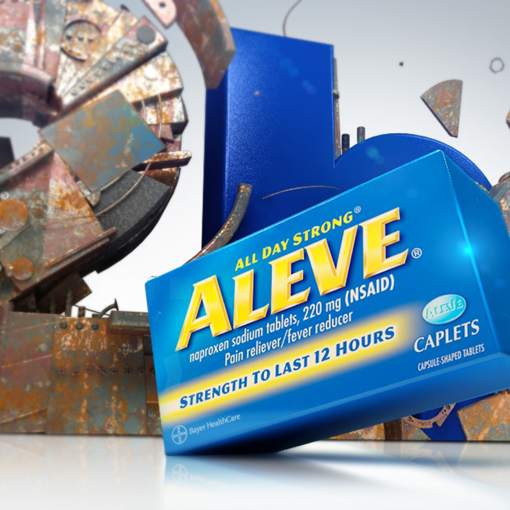
Aleve - Pain ReliefMotion, Storyboards
Minute Maid - NaturalsMotion, Storyboards
Stride Rite - Glitzy PetsStoryboards, Commercial

Coca-Cola - TastemakerInteractive, Motion, Storyboards

Washington LotteryMotion, Stroyboards

Minus The Bear - Record Store DayMusic, Vinyl, Lettering, Print

April Showers Bring May FlowersTypography, Print, Font
Honey BearPrint, Illustration
Coca-Cola - AhhMotion, Illustration
Clorox - Fashionably CleanMotion, Storyboards

J-Power - Powered by NatureMotion, Storyboards

Taco Bell - Doritos LocosMotion, Storyboards, Photography
Shoe Carnival - HolidaysMotion, Storyboards

Sony - The Color of SportMotion, Storyboards
Chase SapphireMotion, Storyboards

Nike: Here I amMotion, Storyboards

AudiMotion, Storyboards

T.Rowe PriceMotion, Storyboards

Betsey JohnsonMotion, Storyboards

Ross: A Brand New DayMotion, Storyboards

Shell: ScientificMotion, Storyboards
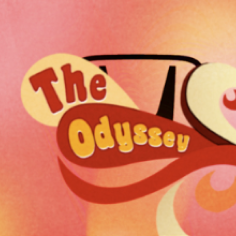
Honda Odyssey: Soul TrainMotion, Storyboards
SunsilkMotion, Storyboards
Pretty PicturesLogo, Print, Branding

Motion StateLogo, Print, Branding

Love & HeartbreakPrint, Photography
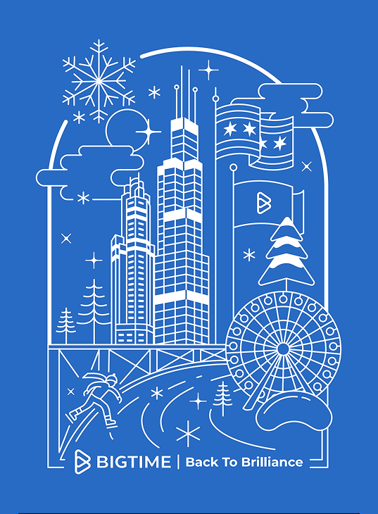
BigTime Annual KickoffPrint, Illustration
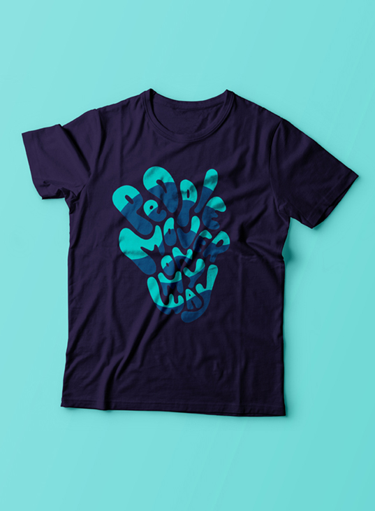
PeoplemoverMusic, Lettering, Print

Wrapped ApparelIllustration, Apparel

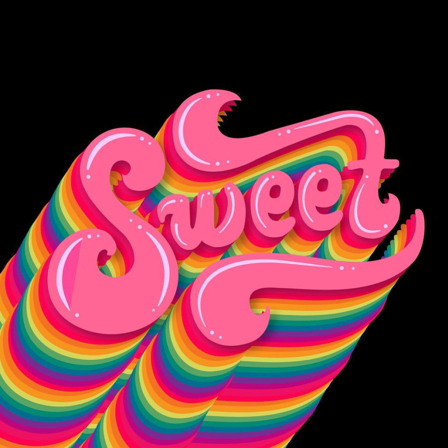
Sweet ToothPrint, Illustration
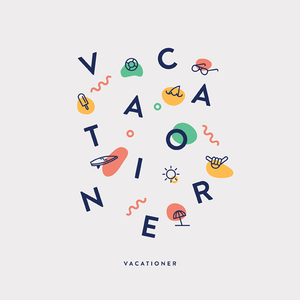
Vacationer - MerchLettering, Print

The Wise OwlLogo, Print, Branding
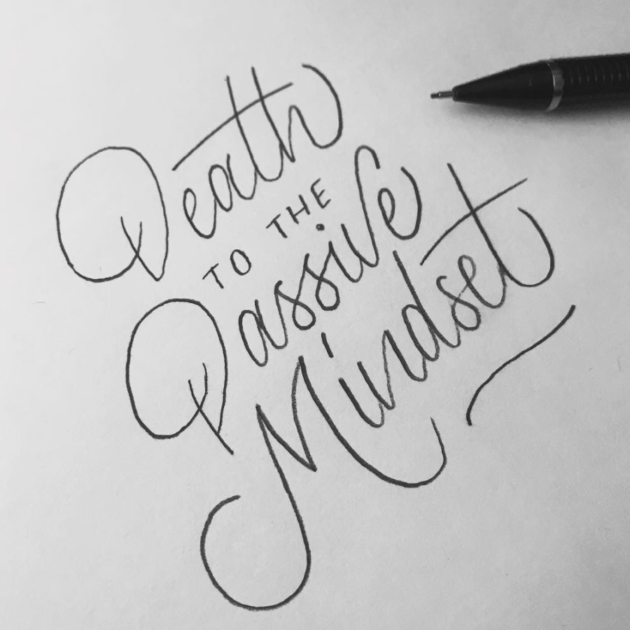
Death to the Passive MindsetLettering

BloomLettering, Drawing
Happy AccidentsPrint, Illustration
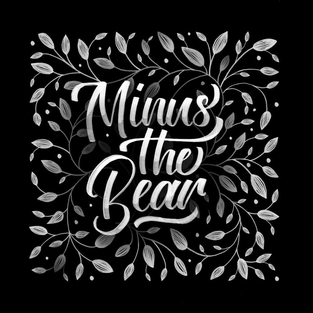
Minus The Bear - BloomLettering, Drawing
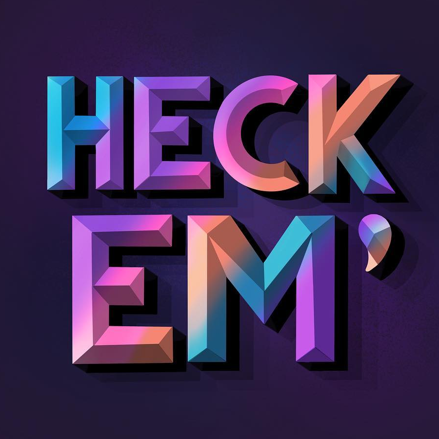
Heck Em'Lettering, Digital
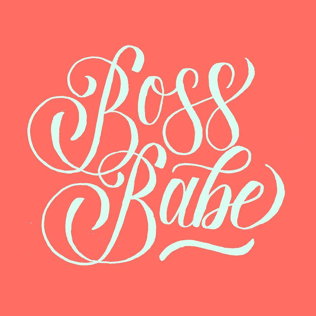
Boss BabeLettering, Digital
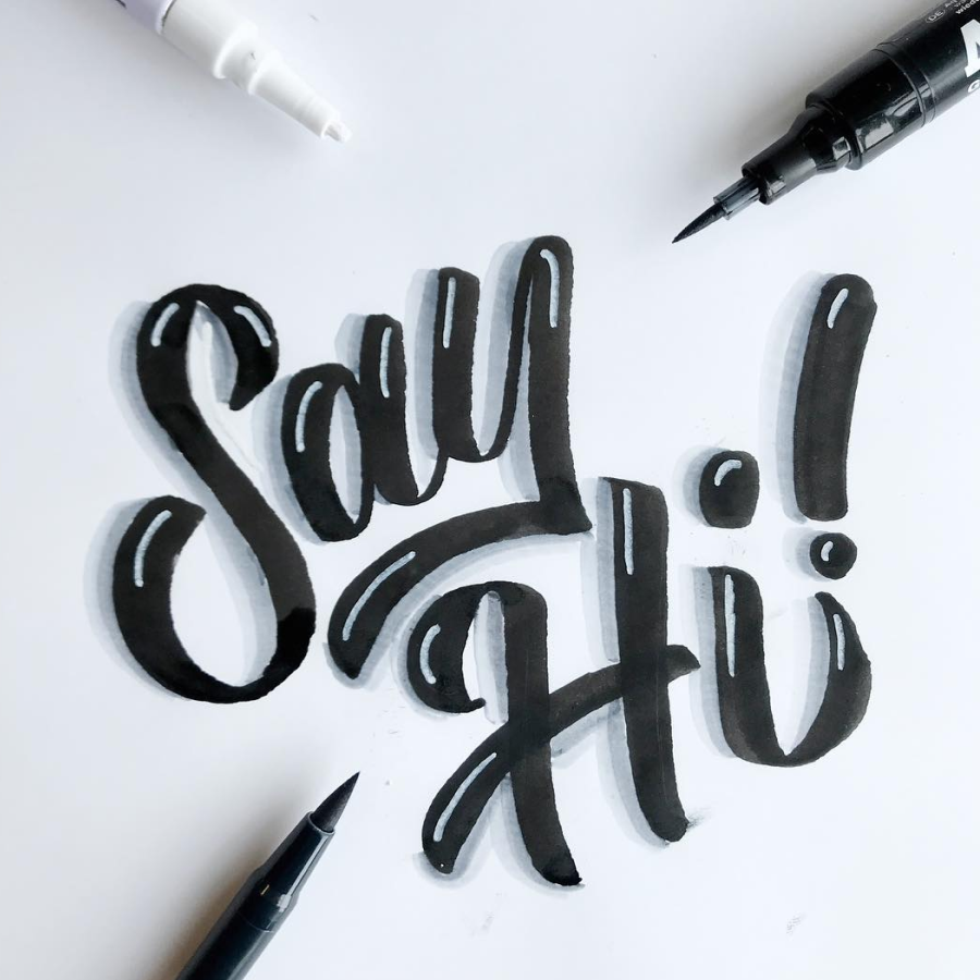
Say Hi!Lettering, Marker

Floral "E"Lettering, Drawing

Chiseled "C"Lettering, Digital
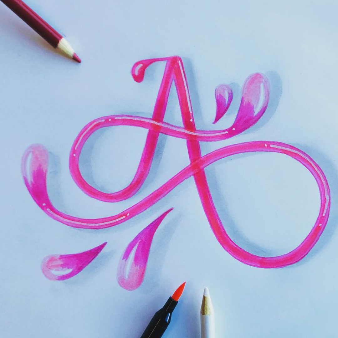
Curly "A"Lettering, Pencil, Pen
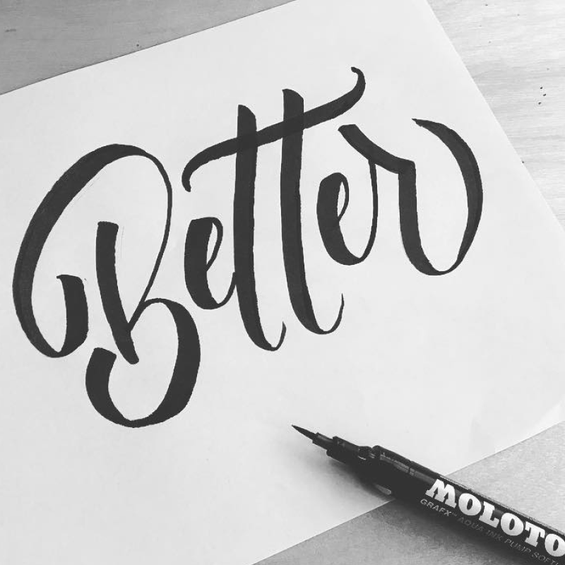
Be BetterLettering, Marker

SeattleLettering, Digital

Forever FriendLettering, Digital
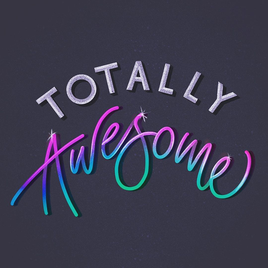
Totally Awesome!Lettering, Digital

Love, Wilderness.Lettering, Digital
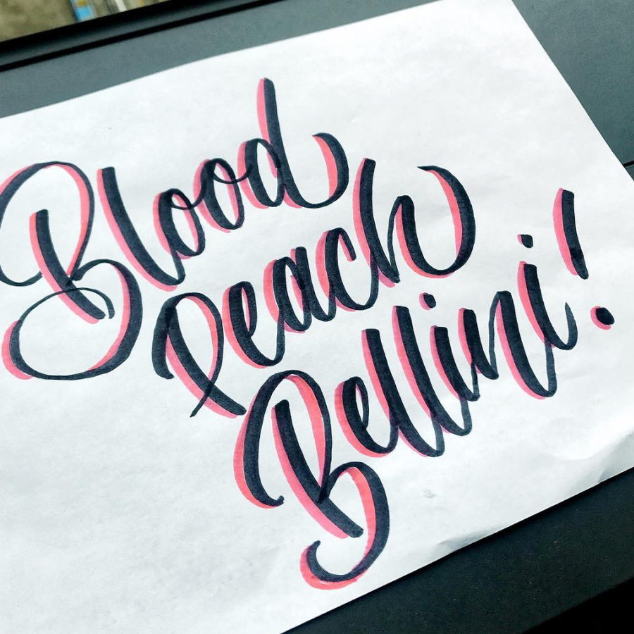
Blood Peach BelliniLettering, Marker
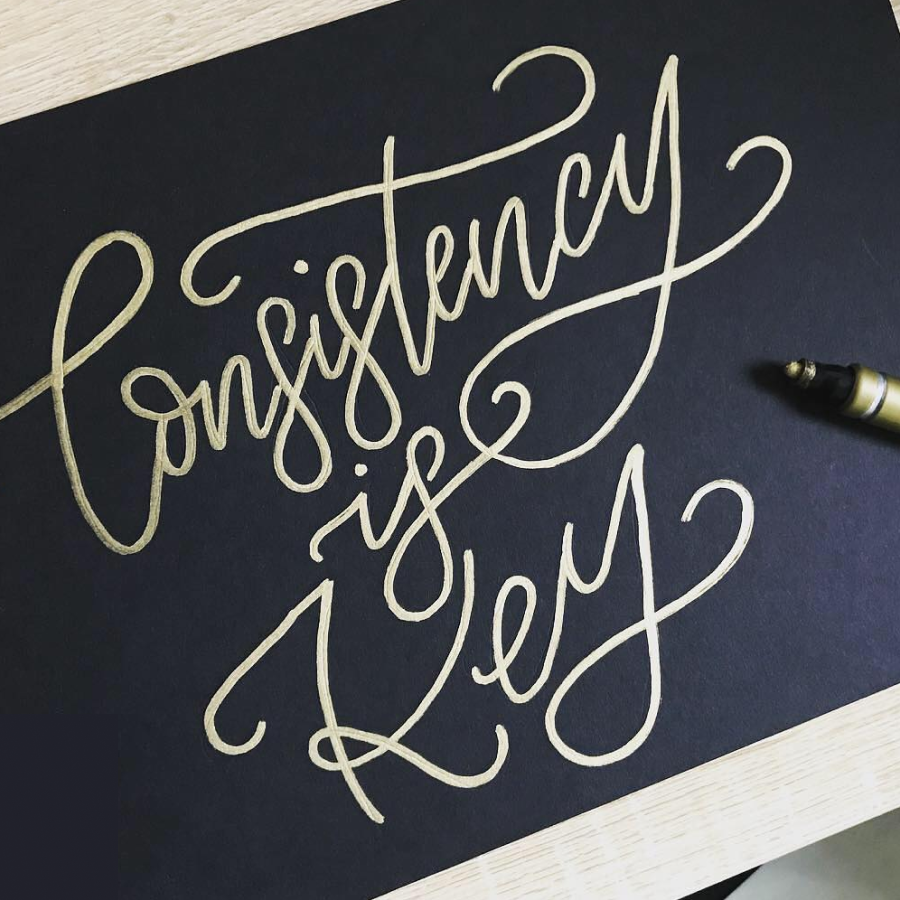
Consistency is KeyLettering, Marker
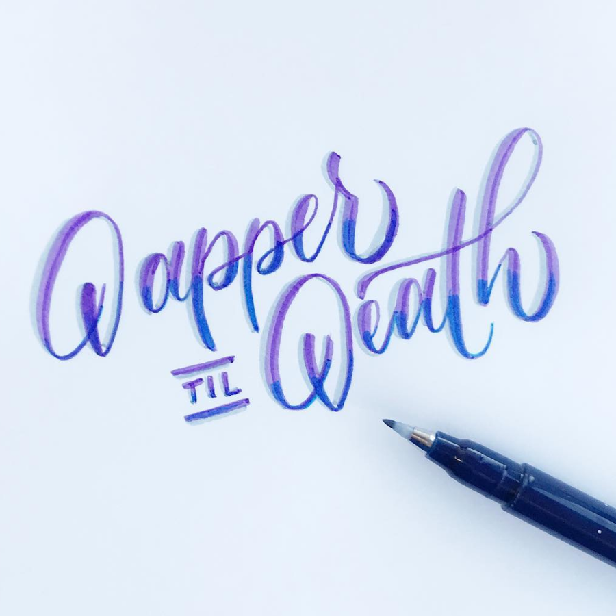
Dapper TIL DeathLettering, Marker
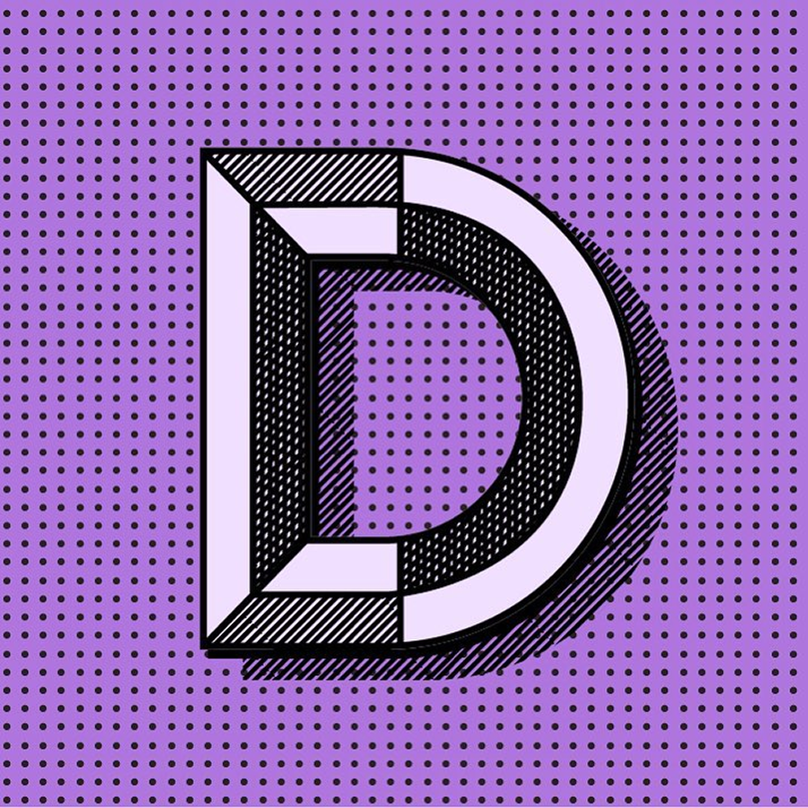
Duotone "D"Lettering, Digital

Easy Does ItLettering, Digital
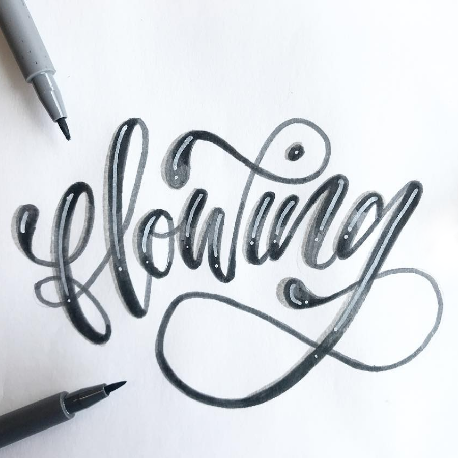
FlowingLettering, Marker
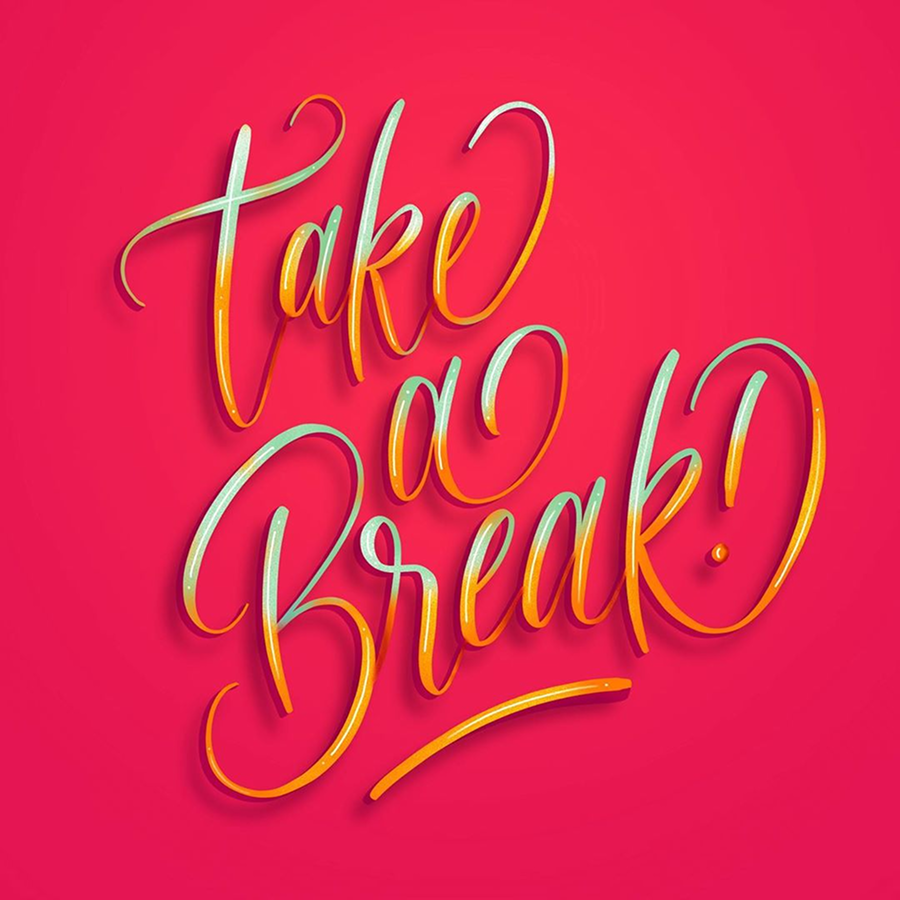
Take a Break!Lettering, Digital

Thrifty BitchLettering, Digital
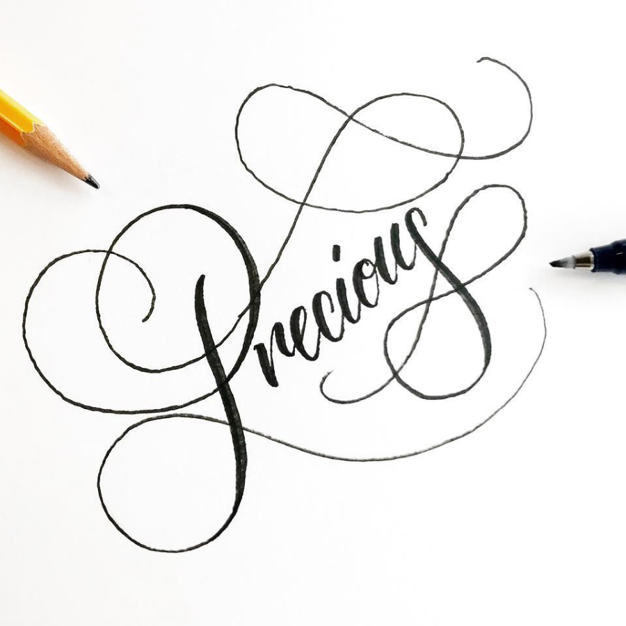
PreciousLettering, Marker
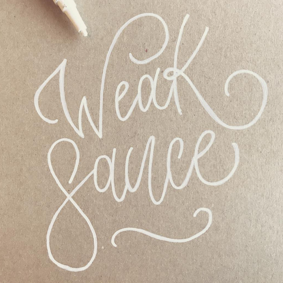
Weak SauceLettering, Marker
The Food Pun SeriesLettering, Digital
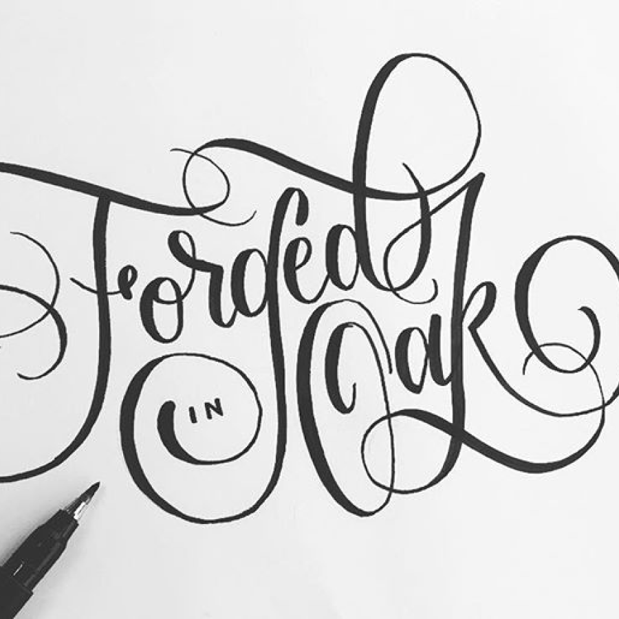
Forged in OakLettering, Branding
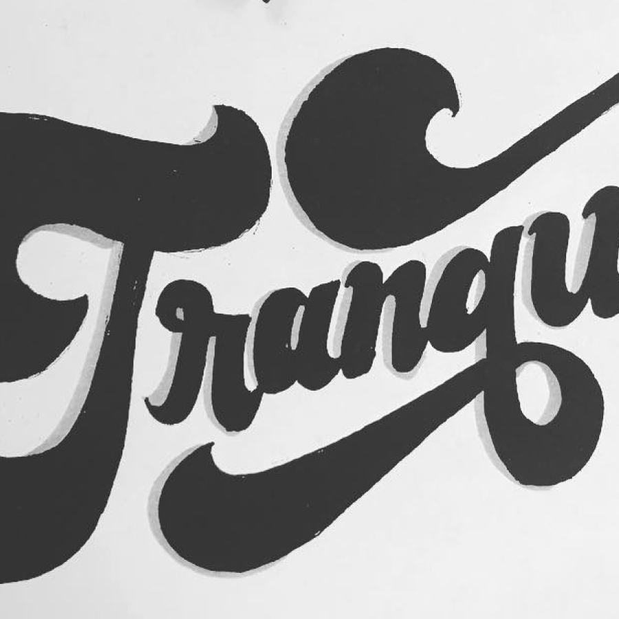
TranquilLettering, Marker

Hell YeahLettering, Digital

Stanford AerobicsLettering, Print
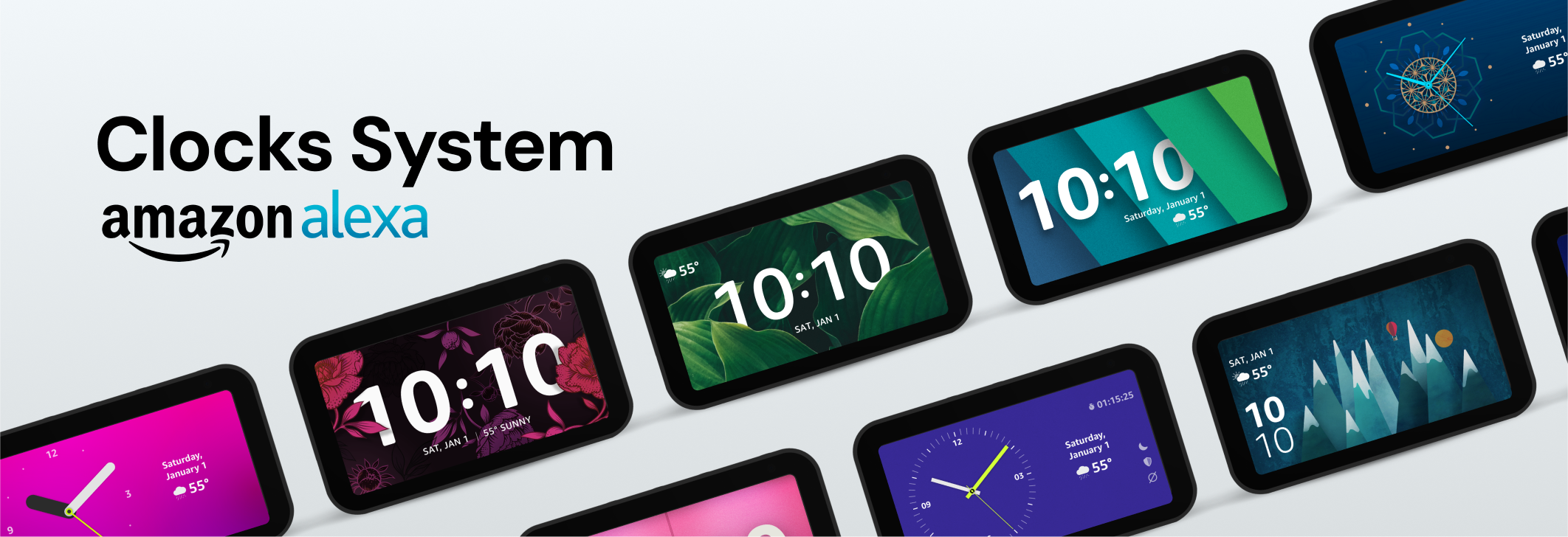
Clocks SystemUX & Interactive, Illustration